


Welcome to Day 8 of the #100DaysOfCode Challenge! Today, we're going to create an animated loader using HTML and CSS. This loader will add a touch of flair to your web projects and engage users while they wait for content to load. Let's dive in step by step!
Step 1: Set Up Your Project
First, let's set up our project by creating an HTML file and a CSS file.
index.html:
<!DOCTYPE html>
<html lang="en">
<head>
    <meta charset="UTF-8">
    <meta name="viewport" content="width=device-width, initial-scale=1.0">
    <link rel="stylesheet" href="style.css">
    <title>Animated Loader</title>
</head>
<body>
    <div class="loader"></div>
</body>
</html>
style.css:
/* Your CSS styles will go here */
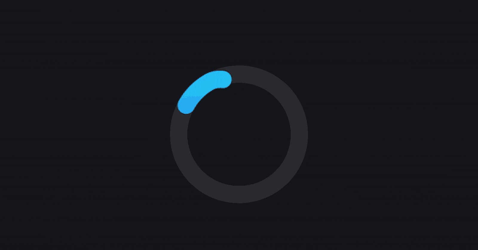
Step 2: Create the Loader
Now, let's create the loader using HTML and style it using CSS.
index.html:
<!DOCTYPE html>
<html lang="en">
<head>
    <meta charset="UTF-8">
    <meta name="viewport" content="width=device-width, initial-scale=1.0">
    <link rel="stylesheet" href="style.css">
    <title>Animated Loader</title>
</head>
<body>
    <div class="loader"></div>
</body>
</html>
style.css:
.loader {
  border: 8px solid #f3f3f3;
  border-top: 8px solid #3498db;
  border-radius: 50%;
  width: 50px;
  height: 50px;
  animation: spin 2s linear infinite;
}

@keyframes spin {
  0% { transform: rotate(0deg); }
  100% { transform: rotate(360deg); }
}
Step 3: Customize the Loader
Feel free to customize the loader's appearance by tweaking the colors, size, and animation speed.
style.css:
.loader {
  border: 8px solid #f3f3f3; /* Outer border color */
  border-top: 8px solid #3498db; /* Loader color */
  border-radius: 50%;
  width: 50px;
  height: 50px;
  animation: spin 2s linear infinite;
}

@keyframes spin {
  0% { transform: rotate(0deg); }
  100% { transform: rotate(360deg); }
}
Step 4: Add a Personal Touch
Consider adding your personal touch to the loader. You can change the colors, add gradients, or even include your logo.
style.css:
.loader {
  border: 8px solid #f3f3f3; /* Outer border color */
  border-top: 8px solid #ff6347; /* Loader color */
  border-radius: 50%;
  width: 50px;
  height: 50px;
  animation: spin 2s linear infinite;
}

@keyframes spin {
  0% { transform: rotate(0deg); }
  100% { transform: rotate(360deg); }
}
Step 5: Final Touches
You can further enhance the loader by adding transitions or adjusting the animation speed.
style.css:
.loader {
  border: 8px solid #f3f3f3; /* Outer border color */
  border-top: 8px solid #ff6347; /* Loader color */
  border-radius: 50%;
  width: 50px;
  height: 50px;
  animation: spin 1s linear infinite; /* Faster animation */
  transition: border-color 0.3s ease; /* Smooth transition */
}

@keyframes spin {
  0% { transform: rotate(0deg); }
  100% { transform: rotate(360deg); }
}
Step 6: Conclusion
Congratulations! You've successfully created a stylish animated loader using HTML and CSS. Feel free to incorporate this loader into your web projects to enhance user experience.
Don't forget to download the full source code from here and follow my coding journey on Twitter. If you need any assistance or have feedback, you can contact me on Bento.
Happy coding! 🚀