

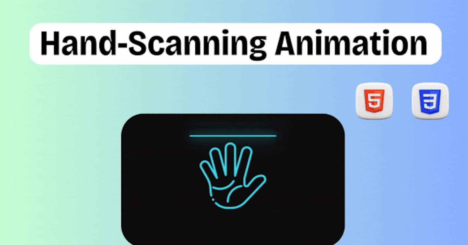


In this tutorial, we'll walk through the step-by-step process of creating a hand-scanning animation using HTML and CSS. This animation creates a visually engaging effect simulating a hand-scanning process, perfect for adding flair to your web projects.
Prerequisites
Basic knowledge of HTML and CSS.
A text editor (e.g., VS Code, Sublime Text).
Web browser.
Step 1: Download the Assets
To begin, download the required assets from the provided link: CodeWithAarzoo Telegram Channel. The assets include two hand images (hand_01.png and hand_02.png), as well as two other images (lines.png and points.png) used for the scanning animation.
Step 2: Setting Up the HTML Structure
Open your text editor and create a new HTML file named index.html. Start by setting up the basic HTML structure:
<!DOCTYPE html>
<html lang="en">

<head>
    <!-- Define the character encoding and viewport settings -->
    <meta charset="UTF-8">
    <meta name="viewport" content="width=device-width, initial-scale=1.0">
    <!-- Link to the external stylesheet -->
    <link rel="stylesheet" href="style.css">
    <!-- Set the title of the webpage -->
    <title>Hand Scanning Animation</title>
</head>

<body>
    <!-- Container for the scanning animation -->
    <div class="scan">
        <!-- Container for the hand image -->
        <div class="hand">
            <!-- Container for the lines representing scanning progress -->
            <div class="lines"></div>
        </div>
        <!-- Heading indicating the type of animation -->
        <h3>Hand Print Scanning</h3>
    </div>
</body>

</html>
This HTML structure includes a container div with the class "scan", containing a hand image (div with class "hand") and lines representing the scanning progress (div with class "lines"). Below the scanning animation, there is a heading indicating the type of animation.
Step 3: Styling with CSS
Create a new CSS file named style.css in the same directory as your HTML file. Add the following CSS styles to create the hand scanning animation effect:
/* Apply CSS reset to remove default margin and padding, and set box-sizing */
* {
    margin: 0;
    padding: 0;
    box-sizing: border-box;
    font-family: consolas;
    /* Set default font family */
}

/* Style the body element */
body {
    display: flex;
    /* Use flexbox for layout */
    justify-content: center;
    /* Center content horizontally */
    align-items: center;
    /* Center content vertically */
    min-height: 100vh;
    /* Set minimum height to cover the viewport */
    background: #111;
    /* Set background color */
}

/* Style the container for the scanning animation */
.scan {
    position: relative;
    /* Positioning context for absolute positioned children */
    display: flex;
    /* Use flexbox for layout */
    flex-direction: column;
    /* Arrange children vertically */
    align-items: center;
    /* Center children horizontally */
}

/* Style the hand image */
.scan .hand {
    position: relative;
    /* Positioning context for pseudo-elements */
    width: 500px;
    /* Set width of the hand image */
    height: 500px;
    /* Set height of the hand image */
    background: url(hand_02.png);
    /* Set background image */
    background-size: 500px;
    /* Set background size to match container */
}

/* Style the scanning animation for the hand image */
.scan .hand::before {
    content: "";
    /* Create a pseudo-element */
    position: absolute;
    /* Position it absolutely within .hand */
    top: 0;
    /* Align it to the top of .hand */
    left: 0;
    /* Align it to the left of .hand */
    width: 100%;
    /* Make it take the full width of .hand */
    height: 100%;
    /* Make it take the full height of .hand */
    background: url(hand_01.png);
    /* Set background image */
    background-size: 500px;
    /* Set background size to match container */
    animation: animate 4s ease-in-out infinite;
    /* Apply animation */
}

/* Define keyframes for the scanning animation */
@keyframes animate {

    0%,
    100% {
        height: 0%;
        /* Set height to 0% at start and end */
    }

    50% {
        height: 100%;
        /* Set height to 100% at 50% mark */
    }
}

/* Style the scanning lines */
.scan .hand::after {
    content: "";
    /* Create a pseudo-element */
    position: absolute;
    /* Position it absolutely within .hand */
    top: 0;
    /* Align it to the top of .hand */
    left: 0;
    /* Align it to the left of .hand */
    width: 100%;
    /* Make it take the full width of .hand */
    height: 8px;
    /* Set height of the scanning lines */
    background: #3fefef;
    /* Set background color of the lines */
    border-radius: 8px;
    /* Apply border radius to create rounded ends */
    filter: drop-shadow(0 0 20px #3fefef) drop-shadow(0 0 60px #3fefef);
    /* Apply drop shadow effect */
    animation: animateLines 4s ease-in-out infinite;
    /* Apply animation */
}

/* Define keyframes for the scanning lines animation */
@keyframes animateLines {

    0%,
    100% {
        top: 0%;
        /* Set top position to 0% at start and end */
    }

    50% {
        top: 100%;
        /* Set top position to 100% at 50% mark */
    }
}

/* Style the heading */
.scan h3 {
    text-transform: uppercase;
    /* Transform text to uppercase */
    font-size: 2em;
    /* Set font size */
    letter-spacing: 2px;
    /* Set letter spacing */
    margin-top: 20px;
    /* Set top margin */
    color: #3fefef;
    /* Set text color */
    filter: drop-shadow(0 0 20px #3fefef) drop-shadow(0 0 60px #3fefef);
    /* Apply drop shadow effect */
    animation: animateText 0.5s steps(1) infinite;
    /* Apply animation */
}

/* Define keyframes for the text animation */
@keyframes animateText {

    0%,
    100% {
        opacity: 0;
        /* Set opacity to 0 at start and end */
    }

    50% {
        opacity: 1;
        /* Set opacity to 1 at 50% mark */
    }
}

/* Style the lines representing scanning progress */
.scan .hand .lines {
    position: absolute;
    /* Position it absolutely within .hand */
    inset: 0;
    /* Make it fill the entire .hand container */
}

/* Style the lines image */
.scan .hand .lines::before {
    content: "";
    /* Create a pseudo-element */
    position: absolute;
    /* Position it absolutely within .lines */
    top: 0;
    /* Align it to the top of .lines */
    left: 0;
    /* Align it to the left of .lines */
    width: 500px;
    /* Set width of the lines image */
    height: 500px;
    /* Set height of the lines image */
    background: url(lines.png);
    /* Set background image */
    background-size: 500px;
    /* Set background size to match container */
    animation: handLines 4s ease-in-out infinite;
    /* Apply animation */
}

/* Define keyframes for the lines animation */
@keyframes handLines {

    0%,
    25%,
    100% {
        height: 0;
        /* Set height to 0 at start, 25%, and end */
    }

    50% {
        height: 100%;
        /* Set height to 100% at 50% mark */
    }
}

/* Style the points image */
.scan .hand .lines::after {
    content: "";
    /* Create a pseudo-element */
    position: absolute;
    /* Position it absolutely within .lines */
    top: 0;
    /* Align it to the top of .lines */
    left: 0;
    /* Align it to the left of .lines */
    width: 500px;
    /* Set width of the points image */
    height: 500px;
    /* Set height of the points image */
    background: url(points.png);
    /* Set background image */
    background-size: 500px;
    /* Set background size to match container */
    animation: handPoints 4s ease-in-out infinite;
    /* Apply animation */
}

/* Define keyframes for the points animation */
@keyframes handPoints {

    0%,
    100% {
        height: 0;
        /* Set height to 0 at start and end */
    }

    50% {
        height: 100%;
        /* Set height to 100% at 50% mark */
    }
}
Step 4: Add the Assets
Make sure to place the downloaded images (hand_01.png, hand_02.png, lines.png, and points.png) in the same directory as your HTML and CSS files.
Step 5: View the Animation
Open the index.html file in your web browser, and you should see the hand scanning animation effect in action!
Conclusion
In this tutorial, we've learned how to create a hand-scanning animation using HTML and CSS. By following these steps, you can easily integrate this animation into your web projects to add an engaging visual element.
Happy coding! 🚀