

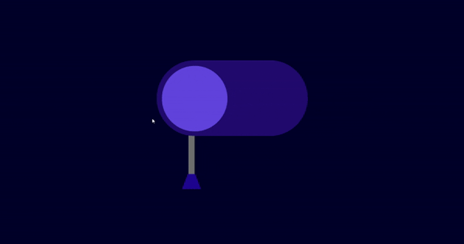


Are you ready for Day 17 of the #100DaysOfCode challenge ? Today, we're going to dive into creating a cool glowing toggle switch using HTML and CSS. Let's get started with the step-by-step process.
Step 1: Setting Up the HTML Structure
First, let's set up the basic HTML structure for our project.
<!DOCTYPE html>
<html lang="en">

<head>
    <!-- Set character encoding to UTF-8 -->
    <meta charset="UTF-8">
    <!-- Ensure proper rendering and compatibility with IE -->
    <meta http-equiv="X-UA-Compatible" content="IE=edge">
    <!-- Set viewport for responsive design -->
    <meta name="viewport" content="width=device-width, initial-scale=1.0">
    <!-- Link external CSS file -->
    <link rel="stylesheet" href="style.css">
    <!-- Set title of the page -->
    <title>Glowing Toggle Switch</title>
</head>

<body>
    <!-- Container for the toggle switch -->
    <div class="container">
        <!-- Input element for the toggle switch -->
        <input type="checkbox" id="light">
        <!-- Label associated with the input element -->
        <label for="light"></label>
    </div>
</body>

</html>
Step 2: Styling with CSS
Now, let's add some CSS to style our toggle switch.
/* Reset default margin, padding, and box-sizing */
* {
    margin: 0;
    padding: 0;
    box-sizing: border-box;
}

/* Set background color for the body */
body {
    background-color: rgb(1, 1, 41);
}

/* Style for the container */
.container {
    /* Position the container in the center of the viewport */
    position: absolute;
    top: 50%;
    left: 50%;
    transform: translate(-50%, -50%);
    /* Set dimensions for the container */
    height: 25em;
    width: 25em;
}

/* Style for the checkbox input */
input[type="checkbox"] {
    /* Remove default appearance */
    appearance: none;
    /* Position the checkbox */
    position: absolute;
    top: 6.25em;
    left: 50%;
    transform: translate(-50%);
    /* Set dimensions and shape for the checkbox */
    height: 9.37em;
    width: 18.75em;
    border-radius: 4.68em;
    /* Set background color for the checkbox */
    background-color: #220c6f;
}

/* Style for the inner circle of the checkbox */
input[type="checkbox"]::before {
    /* Position the inner circle */
    position: absolute;
    top: 0.68em;
    left: 0.68em;
    content: "";
    /* Set dimensions and shape for the inner circle */
    height: 8.12em;
    width: 8.12em;
    border-radius: 50%;
    /* Set background color for the inner circle */
    background-color: #6243dc;
    /* Add transition effect */
    transition: 0.3s;
}

/* Style for the label representing the light */
label[for="light"] {
    /* Position the label */
    position: absolute;
    top: 11em;
    left: 8em;
    /* Ensure the label is behind the checkbox */
    z-index: -1;
    /* Set dimensions for the label */
    height: 6.25em;
    width: 0.62em;
    /* Set background color for the label */
    background-color: rgb(111, 110, 110);
    /* Add transition effect */
    transition: 0.3s;
}

/* Style for the light beam of the label */
label[for="light"]::after {
    /* Position the light beam */
    position: absolute;
    top: 5.93em;
    left: -0.68em;
    content: "";
    /* Set dimensions and shape for the light beam */
    height: 0;
    width: 0.75em;
    border-bottom: 1.56em solid #1f068f;
    border-left: 0.62em solid transparent;
    border-right: 0.62em solid transparent;
}

/* Cursor style for the checkbox and label */
input[type="checkbox"],
label[for="light"] {
    cursor: pointer;
}

/* Style for the inner circle of the checkbox when checked */
input[type="checkbox"]:checked::before {
    /* Move the inner circle to the right and change its color */
    position: absolute;
    left: 10.1em;
    background-color: #f5f5f5;
    /* Add box-shadow effect */
    box-shadow: 0 0 8.75em 1.87em rgba(196, 241, 255, 0.8);
}

/* Adjust position of label when checkbox is checked */
input[type="checkbox"]:checked+label {
    top: 12em;
}
Step 3: Conclusion
And there you have it! We've successfully created a glowing toggle switch using HTML and CSS. Feel free to customize the colors, sizes, and positions to match your project's design.
You can download the full source code here.
If you have any questions or feedback, don't hesitate to contact me. Keep coding and stay tuned for more exciting projects in the #100DaysOfCode challenge!