


Introduction
Welcome to the Day 15 of the #100DaysOfCode Challenge! Today, we're going to dive into creating an animated preloader using SVG and CSS. Preloaders are essential for enhancing user experience by indicating that content is loading. We'll break down the process step by step, and by the end of this tutorial, you'll have a stylish animated preloader for your projects.
Step 1
Setting Up the HTML Structure
Let's start by creating the basic HTML structure for our preloader:
<!DOCTYPE html>
<html lang="en">
<head>
<meta charset="UTF-8">
<meta name="viewport" content="width=device-width, initial-scale=1.0">
<link rel="stylesheet" href="style.css">
<title>Animated Preloader</title>
</head>
<body>
<main>
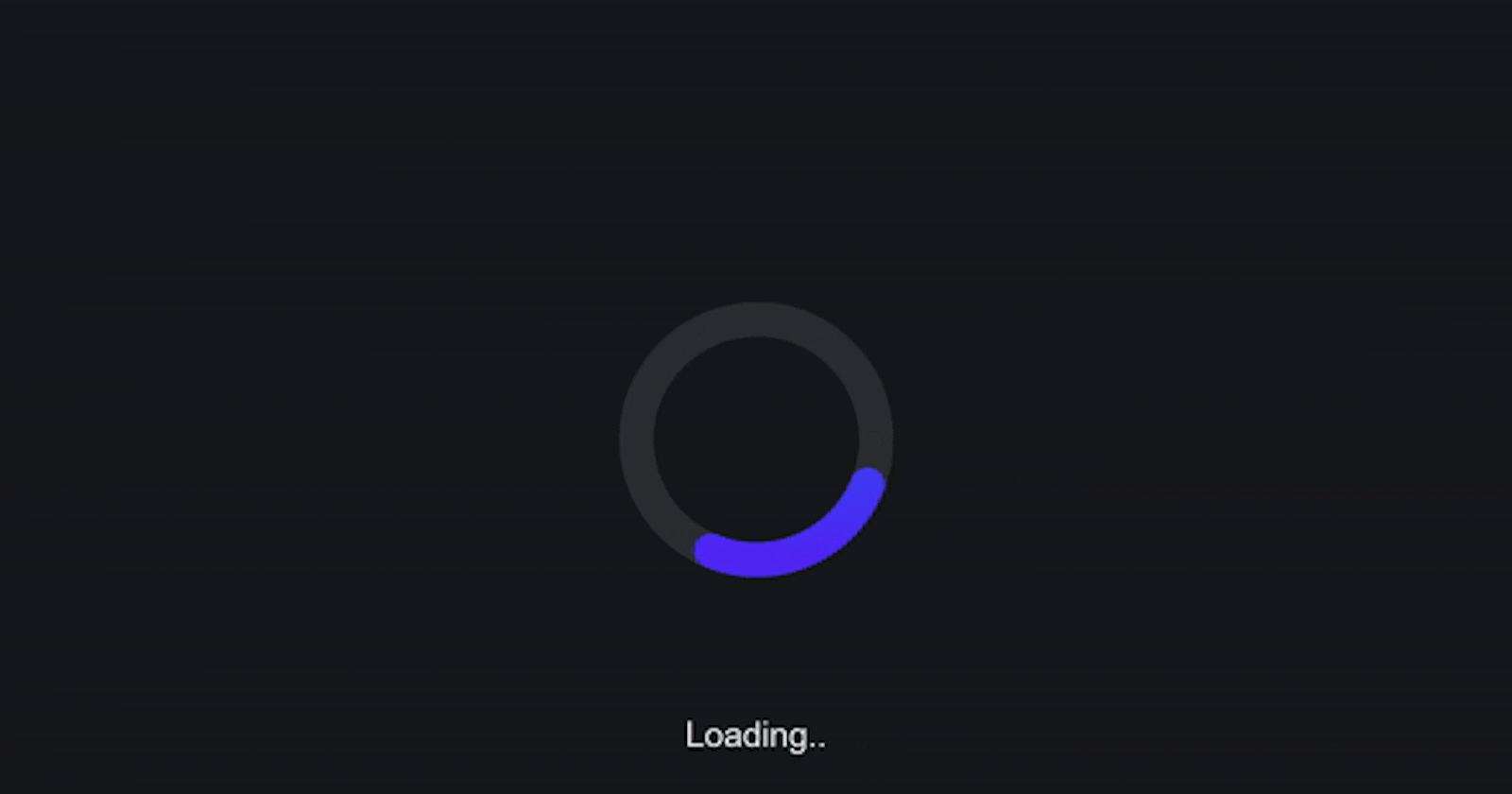
<svg class="ap" viewBox="0 0 128 256" width="128px" height="256px" xmlns="http://www.w3.org/2000/svg">
<defs>
<linearGradient id="ap-grad1" x1="0" y1="0" x2="0" y2="1">
<stop offset="0%" stop-color="hsl(223,90%,55%)" />
<stop offset="100%" stop-color="hsl(253,90%,55%)" />
</linearGradient>
<linearGradient id="ap-grad2" x1="0" y1="0" x2="0" y2="1">
<stop offset="0%" stop-color="hsl(193,90%,55%)" />
<stop offset="50%" stop-color="hsl(223,90%,55%)" />
<stop offset="100%" stop-color="hsl(253,90%,55%)" />
</linearGradient>
</defs>
<circle class="ap__ring" r="56" cx="64" cy="192" fill="none" stroke="#ddd" stroke-width="16"
stroke-linecap="round" />
<circle class="ap__worm1" r="56" cx="64" cy="192" fill="none" stroke="url(#ap-grad1)" stroke-width="16"
stroke-linecap="round" stroke-dasharray="87.96 263.89" />
<path class="ap__worm2" d="M120,192A56,56,0,0,1,8,192C8,161.07,16,8,64,8S120,161.07,120,192Z" fill="none"
stroke="url(#ap-grad2)" stroke-width="16" stroke-linecap="round" stroke-dasharray="87.96 494" />
</svg>
</main>
Loading..
</body>
</html>
Step 2
Styling with CSS
Now, let's add the CSS to style our preloader and create the animation effects:
* {
    border: 0;
    box-sizing: border-box;
    margin: 0;
    padding: 0;
}

:root {
    --hue: 223;
    --bg: hsl(var(--hue), 10%, 90%);
    --fg: hsl(var(--hue), 10%, 10%);
    font-size: calc(16px + (24 - 16) * (100vw - 320px) / (1280 - 320));
}

body {
    background-color: var(--bg);
    color: var(--fg);
    font: 1em/1.5 sans-serif;
    height: 100vh;
    display: grid;
    place-items: center;
    transition: background-color 0.3s;
}

main {
    padding: 1.5em 0;
}

.ap {
    width: 8em;
    height: 16em;
}

.ap__ring {
    stroke: hsla(var(--hue), 10%, 10%, 0.15);
    transition: stroke 0.3s;
}

.ap__worm1,
.ap__worm2 {
    animation-duration: 3s;
    animation-iteration-count: infinite;
}

.ap__worm1 {
    animation-name: worm1;
}

.ap__worm2 {
    animation-name: worm2;
    visibility: hidden;
}

/* Dark theme */
@media (prefers-color-scheme: dark) {
    :root {
        --bg: hsl(var(--hue), 10%, 10%);
        --fg: hsl(var(--hue), 10%, 90%);
    }

    .ap__ring {
        stroke: hsla(var(--hue), 10%, 90%, 0.1);
    }
}
Step 3
Defining Animation Keyframes
In this step, we'll define the animation keyframes for our preloader's worms:
/* Animtions */
@keyframes worm1 {
    from {
        animation-timing-function: ease-in-out;
        stroke-dashoffset: -87.96;
    }

    20% {
        animation-timing-function: ease-in;
        stroke-dashoffset: 0;
    }

    60% {
        stroke-dashoffset: -791.68;
        visibility: visible;
    }

    60.1%,
    to {
        stroke-dashoffset: -791.68;
        visibility: hidden;
    }
}

@keyframes worm2 {

    from,
    60% {
        stroke-dashoffset: -87.96;
        visibility: hidden;
    }

    60.1% {
        animation-timing-function: cubic-bezier(0, 0, 0.5, 0.75);
        stroke-dashoffset: -87.96;
        visibility: visible;
    }

    77% {
        animation-timing-function: cubic-bezier(0.5, 0.25, 0.5, 0.88);
        stroke-dashoffset: -340;
        visibility: visible;
    }

    to {
        stroke-dashoffset: -669.92;
        visibility: visible;
    }
}
Conclusion
Congratulations! You've successfully built an animated preloader using SVG and CSS. Preloaders are a great addition to any website or application to enhance user experience during loading times. Keep practicing and stay tuned for more exciting coding projects in the #100DaysOfCode Challenge!
Download the Full Source Code
You can download the full source code for this project from here.
Contact Me
If you have any questions or want to connect, feel free to contact me through my website.
Happy coding!