


Introduction
Welcome to Day 14 of the #100DaysOfCode challenge! In this project, we'll create a simple yet visually engaging Pencil and Paper Checkbox project. This interactive checkbox design adds a playful touch to your web forms, reminiscent of checkboxes on paper with a pencil mark.
Step 1:
Setting Up the HTML Structure:
Let's begin by setting up the HTML structure. Open your favorite text editor and create a new HTML file. Here's the initial HTML structure:
<!DOCTYPE html>
<html lang="en">
<head>
<!-- Set character encoding for the document -->
<meta charset="UTF-8">
<!-- Set compatibility mode for Internet Explorer -->
<meta http-equiv="X-UA-Compatible" content="IE=edge">
<!-- Set viewport properties for responsive design -->
<meta name="viewport" content="width=device-width, initial-scale=1.0">
<!-- Link to external stylesheet -->
<link rel="stylesheet" href="style.css">
<!-- Set the title of the document -->
<title>Pencil and Paper Checkbox</title>
</head>
<body>
<!-- Create a container div with class "center" -->
<div class="center">
<!-- Create a form -->
<form>
<!-- Create checkbox inputs for different subjects -->
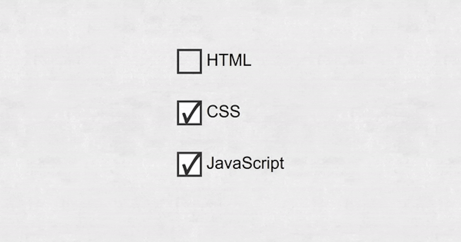
<label><input class="cb pristine" type="checkbox"> <span>HTML</span></label>
<label><input class="cb pristine" type="checkbox"> <span>CSS</span></label>
<label><input class="cb pristine" type="checkbox"> <span>JavaScript</span></label>
</form>
</div>
<!-- Link to external JavaScript file -->
<script src="script.js"></script>
</body>
</html>
Step 2:
Styling with CSS:
Next, let's add some styles to make our checkboxes look like pencil marks on paper. Create a new file named style.css and add the following CSS code:
/* Reset styles for all elements */
*,
*:before,
*:after {
    border: 0;
    box-sizing: border-box;
    margin: 0;
    padding: 0;
}

/* Set the base font size */
:root {
    font-size: 30px;
}

/* Set font and line height for body and input elements */
body,
input {
    font: 1em "Titillium Web", sans-serif;
    line-height: 1.5;
}

/* Styles for the body */
body {
    display: flex;
    align-items: center;
    justify-content: center;
    background: url("https://s22.postimg.cc/gzyyouldd/grey-paper-texture.jpg") center top;
    height: 100vh;
    /* overflow: hidden; */
}

/* Styles for the form */
form {
    margin: 1.5em auto 0;
    padding: 0.75em;
    max-width: 320px;
}

/* Styles for labels */
label {
    display: block;
    margin-bottom: 1.5em;
    -webkit-tap-highlight-color: transparent;
}

/* Styles for the checkbox */
.cb {
    box-shadow: 0 0 0 0.125em rgba(0, 0, 0, 0.75) inset;
    display: inline-block;
    position: relative;
    width: 1.5em;
    height: 1.5em;
    vertical-align: middle;
    -moz-appearance: none;
    -webkit-appearance: none;
}

/* Styles for checkbox before and after */
.cb:before,
.cb:after {
    content: "";
    display: block;
    position: absolute;
}

/* Styles for checkbox before */
.cb:before {
    animation: eraseA 0.5s steps(1) forwards;
    background: url("https://s22.postimg.cc/fi4blx4gx/checkmark.png") 0 0/contain no-repeat;
    /* Change position and size */
    bottom: 0.1em;
    /* Adjust position */
    left: 0.3em;
    /* Adjust position */
    width: 1em;
    /* Adjust size */
    height: 1em;
    /* Adjust size */
}

/* Styles for checkbox after */
.cb:after {
    animation: eraseB 0.5s linear forwards;
    /* Background gradient */
    background: linear-gradient(rgba(255, 255, 255, 0.2) 50%, rgba(255, 255, 255, 0) 50%) 11.2em 0, linear-gradient(#c8646e, #c8646e) 11.2em 0, linear-gradient(90deg, rgba(255, 255, 255, 0.6), rgba(255, 255, 255, 0.6) 0.1em, rgba(255, 255, 255, 0) 0.1em, rgba(255, 255, 255, 0) 0.2em, rgba(0, 0, 0, 0.2) 0.2em, rgba(0, 0, 0, 0.2) 0.3em, rgba(0, 0, 0, 0) 0.3em) 9.8em 0/0.3em 100%, repeating-linear-gradient(rgba(255, 255, 255, 0.6), rgba(255, 255, 255, 0.6) 0.1em, rgba(255, 255, 255, 0) 0.1em, rgba(255, 255, 255, 0) 0.2em) 10.2em 0/0.5em 100%, linear-gradient(90deg, rgba(255, 255, 255, 0.6), rgba(255, 255, 255, 0.6) 0.1em, rgba(255, 255, 255, 0) 0.1em, rgba(255, 255, 255, 0) 0.2em, rgba(0, 0, 0, 0.2) 0.2em, rgba(0, 0, 0, 0.2) 0.3em, rgba(0, 0, 0, 0) 0.3em) 10.8em 0/0.3em 100%, linear-gradient(rgba(255, 255, 255, 0) 35%, rgba(255, 255, 255, 0.6) 35%, rgba(255, 255, 255, 0.6) 65%, rgba(255, 255, 255, 0) 65%) 9.7em 0, linear-gradient(#b4b4b4, #b4b4b4) 9.7em 0, linear-gradient(rgba(0, 0, 0, 0.1) 27%, rgba(0, 0, 0, 0) 27%, rgba(0, 0, 0, 0) 73%, rgba(0, 0, 0, 0.2) 73%) 2em 0, linear-gradient(#f0d000, #f0d000) 2em 0, linear-gradient(-14deg, #1e1e1e 18%, rgba(30, 30, 30, 0) 20%) 0 0/0.5em 0.5em, linear-gradient(14deg, rgba(30, 30, 30, 0) 80%, #1e1e1e 83%) 0 0.5em/0.5em 0.5em, linear-gradient(-14deg, #d2a078 48%, rgba(210, 160, 120, 0) 50%) 0 0/2em 0.5em, linear-gradient(14deg, rgba(0, 0, 0, 0) 48%, rgba(0, 0, 0, 0.1) 50%) 0 0.5em/2em 0.5em, linear-gradient(14deg, rgba(210, 160, 120, 0) 48%, #d2a078 50%) 0 0.5em/2em 0.5em;
    background-repeat: no-repeat;
    border-radius: 0 0.1em 0.1em 0;
    opacity: 0.9;
    visibility: hidden;
    transform-origin: 0 0.25em;
    width: 12em;
    height: 1em;
}

/* Styles for checked checkbox */
.cb:checked {
    background-color: #fff;
    /* Change to white or any desired color */
}

/* Styles for checked checkbox before */
.cb:checked:before {
    animation: drawA 0.5s linear forwards;
}

/* Styles for checked checkbox after */
.cb:checked:after {
    animation: drawB 0.5s linear;
}

/* Styles for focused checkbox */
.cb:focus {
    outline: transparent;
}

/* Styles for focused checkbox span */
.cb:focus+span {
    color: rgba(0, 0, 0, 0.75);
    outline: transparent;
}

/* Styles for pristine state checkbox */
.pristine:before,
.pristine:after {
    animation: none;
}

/* Keyframes for drawing animation for checkbox before */
@keyframes drawA {

    from,
    5% {
        width: 0;
        height: 1.35em;
    }

    90%,
    to {
        width: 1.2em;
        height: 1.35em;
    }
}

/* Keyframes for drawing animation for checkbox after */
@keyframes drawB {
    from {
        opacity: 0;
        transform: translate(0em, -0.5em) rotate(-50deg);
        visibility: visible;
    }

    5% {
        opacity: 1;
        transform: translate(0em, 0.3em) rotate(-60deg);
    }

    17% {
        transform: translate(0.25em, 0.8em) rotate(-65deg);
    }

    79% {
        transform: translate(1.1em, -0.14em) rotate(-63deg);
    }

    90% {
        opacity: 1;
        transform: translate(1.2em, -0.15em) rotate(-63deg);
    }

    to {
        opacity: 0;
        transform: translate(1.25em, -1.7em) rotate(-63deg);
    }
}

/* Keyframes for erasing animation for checkbox before */
@keyframes eraseA {
    from {
        width: 1.2em;
        height: 1.35em;
    }

    10% {
        width: 1.2em;
        height: 1.08em;
    }

    27% {
        width: 1.2em;
        height: 0.81em;
    }

    36% {
        width: 1.2em;
        height: 0.7em;
    }

    45% {
        width: 1.2em;
        height: 0.55em;
    }

    55% {
        width: 1.2em;
        height: 0.35em;
    }

    80%,
    to {
        width: 1.2em;
        height: 0;
    }
}

/* Keyframes for erasing animation for checkbox after */
@keyframes eraseB {
    from {
        opacity: 0;
        transform: translate(0.6em, -12.2em) rotate(90deg);
        visibility: visible;
    }

    10% {
        opacity: 1;
        transform: translate(1.2em, -12.05em) rotate(90deg);
    }

    20% {
        transform: translate(0.6em, -11.9em) rotate(90deg);
    }

    30% {
        transform: translate(1.2em, -11.75em) rotate(90deg);
    }

    40% {
        transform: translate(0.6em, -11.6em) rotate(90deg);
    }

    50% {
        transform: translate(1.2em, -11.45em) rotate(90deg);
    }

    60% {
        transform: translate(0.6em, -11.3em) rotate(90deg);
    }

    70% {
        transform: translate(1.2em, -11.15em) rotate(90deg);
    }

    80% {
        transform: translate(0.6em, -11em) rotate(90deg);
    }

    90% {
        opacity: 1;
        transform: translate(2em, -12.5em) rotate(100deg);
    }

    to {
        opacity: 0;
        transform: translate(2em, -12.5em) rotate(100deg);
    }
}
Step 3:
Adding JavaScript Functionality:
To make our checkboxes interactive, we'll add JavaScript to toggle the state of the checkboxes. Create a new file named script.js and add the following JavaScript code:
Now, let's add functionality to our checkboxes. We'll use JavaScript to remove the 'pristine' class when a checkbox is clicked. This will visually indicate that the checkbox has been marked. Add the following JavaScript code to script.js:
// Wait for the DOM content to be fully loaded
document.addEventListener("DOMContentLoaded", function () {
  // Select all elements with the class "cb" (checkboxes) and iterate over them
  document.querySelectorAll(".cb").forEach(function (checkbox) {
    // Add a click event listener to each checkbox
    checkbox.addEventListener("click", function (e) {
      // Get the classList of the clicked checkbox
      let checkboxCL = e.target.classList,
        // Define a constant for the pristine state class
        pState = "pristine";

      // If the checkbox contains the pristine state class, remove it
      if (checkboxCL.contains(pState)) checkboxCL.remove(pState);
    });
  });
});
Step 4:
Final Touches and Testing:
With the HTML, CSS, and JavaScript in place, save all your files. Open the HTML file in your web browser to see your Pencil and Paper Checkbox project in action!
Conclusion:
Congratulations on completing Day 14 of the #100DaysOfCode challenge! You've learned how to create an interactive checkbox design using HTML, CSS, and JavaScript. Keep practicing, and stay tuned for more exciting projects in the journey of becoming a proficient web developer!
Download the Full Source Code:
You can download the full source code of this project from here.
Connect with Me:
If you have any questions or want to connect with me, feel free to reach out via my website.
Happy Coding!