

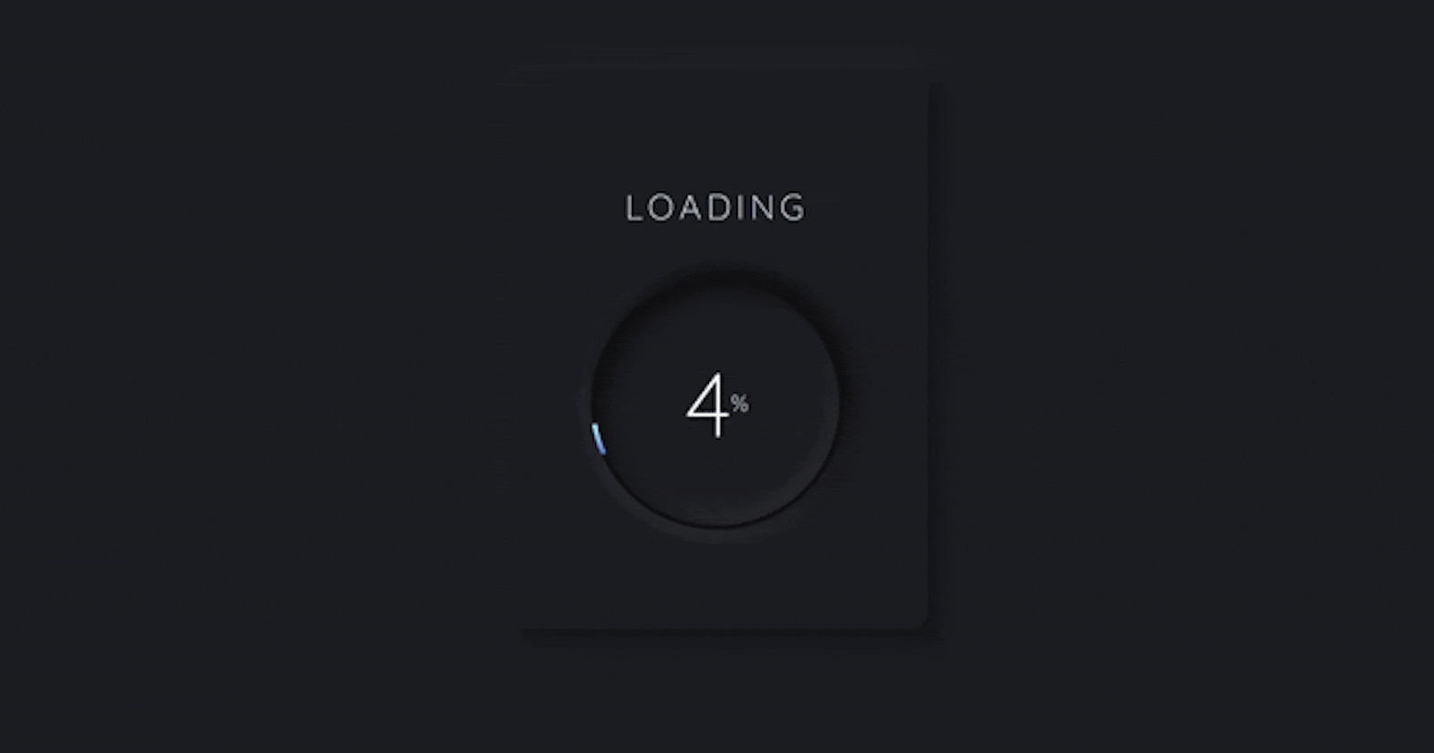


Are you ready to add a touch of elegance to your web projects? In this tutorial, we'll guide you through the process of creating a stunning Neumorphism loader. This project is part of Day 18 of the #100DaysOfCode Challenge. Let's dive in!
1. Introduction to Neumorphism:
Neumorphism, also known as "soft UI," is a design trend that combines elements of skeuomorphism and flat design to create interfaces that appear to be slightly raised from the background. This aesthetic has gained popularity for its modern and elegant appearance.
2. Setting Up the Project:
Download the full source code from here to get started. Once downloaded, extract the files to your desired location.
3. HTML Structure:
Open the HTML file (index.html) in your preferred code editor. Define the basic structure of the HTML document, including <!DOCTYPE html>, <html>, <head>, and <body>. Link the necessary CSS and JavaScript files.
<!DOCTYPE html>
<html lang="en">

<head>
    <!-- Meta tags for character set and viewport -->
    <meta charset="UTF-8">
    <meta name="viewport" content="width=device-width, initial-scale=1.0">

    <!-- Link to external stylesheet -->
    <link rel="stylesheet" href="style.css">

    <!-- Title of the webpage -->
    <title>Neumorphism Loader</title>
</head>

<body>
    <!-- Loader container -->
    <div class="loading-box">
        <!-- Loading title -->
        <p class="loading-title">Loading</p>

        <!-- Loading circle -->
        <div class="loading-circle">
            <!-- Loading count with dynamic percentage -->
            <p class="loading-count"><span id="loadingNumber">0</span>%</p>
        </div>
    </div>

    <!-- Link to external JavaScript file -->
    <script src="script.js"></script>
</body>

</html>
4. Styling with CSS:
Open the CSS file (style.css) and add styles to create the Neumorphism effect. This includes defining styles for the body, loading box, loading title, loading circle, and loading count.
/* Importing Google Fonts */
@import url("https://fonts.googleapis.com/css2?family=Quicksand:wght@300&display=swap");

/* Resetting default styles for html and body */
html,
body {
    width: 100%;
    height: 100%;
    padding: 0;
    margin: 0;
}

/* Styling for the body */
body {
    background: #1d1e22;
    display: flex;
    justify-content: center;
    align-items: center;
    font-family: "Quicksand";
    /* Setting font family */
}

/* Styling for the loading box */
.loading-box {
    position: relative;
    width: 300px;
    height: 400px;
    display: flex;
    flex-direction: column;
    justify-content: center;
    align-items: center;
    color: #f0f8ff;
    /* Setting text color */
    border-radius: 12px;
    box-shadow: 4px 4px 16px rgba(0, 0, 0, 0.5), -4px -4px 16px rgba(255, 255, 255, 0.05);
    /* Applying box shadow */
}

/* Styling for the loading title */
.loading-title {
    font-size: 1.5em;
    /* Setting font size */
    transform: translateY(-12px);
    /* Adjusting position */
    text-transform: uppercase;
    /* Converting text to uppercase */
    letter-spacing: 4px;
    /* Setting letter spacing */
    font-weight: 300;
    /* Setting font weight */
}

/* Styling for the loading circle */
.loading-circle {
    position: relative;
    display: flex;
    justify-content: center;
    align-items: center;
    width: 180px;
    height: 180px;
    /* Applying conic gradient background */
    background: conic-gradient(from 0deg at 50% 50%, rgba(111, 123, 247, 1) 0%, rgba(155, 248, 244, 1) 0%, #101012 0%);
    border-radius: 100px;
    /* Applying box shadow */
    box-shadow: 4px 4px 16px rgba(0, 0, 0, 0.75), -4px -4px 16px rgba(255, 255, 255, 0.1);
    animation: spin 1s infinite linear;
    /* Applying rotation animation */
}

/* Keyframes for rotation animation */
@keyframes spin {
    0% {
        transform: rotate(0deg);
    }

    100% {
        transform: rotate(360deg);
    }
}

/* Styling for the loading count */
.loading-count {
    content: " ";
    display: flex;
    justify-content: center;
    align-items: center;
    top: 3px;
    left: 3px;
    width: 174px;
    height: 174px;
    border-radius: 100px;
    background: #1d1e22;
    /* Applying box shadow */
    box-shadow: 4px 4px 16px rgba(0, 0, 0, 0.75) inset, -4px -4px 16px rgba(255, 255, 255, 0.1) inset;
    animation: spin 1s infinite linear reverse;
    /* Applying rotation animation in reverse */
}

/* Styling for the loading number */
.loading-count #loadingNumber {
    font-size: 4em;
    /* Setting font size */
}
5. Adding JavaScript Functionality:
Open the JavaScript file (script.js) and define the functionality to update the loader. This includes selecting the necessary elements and setting up an interval to increment the loader value.
// Selecting the loading number element by its ID
const loadingNumber = document.querySelector("#loadingNumber");

// Selecting the loading circle element by its class
const loadingCircle = document.querySelector(".loading-circle");

// Initializing the load variable to 0
let load = 0;

// Setting up an interval to call the updateLoader function every 150 milliseconds
setInterval(updateLoader, 150);

// Function to update the loader
function updateLoader() {
  // Incrementing load by 1 if it's less than 100
  load += load < 100;

  // Updating the innerHTML of the loading number element with the current load value
  loadingNumber.innerHTML = load;

  // Updating the background of the loading circle with a conic gradient based on the current load value
  loadingCircle.style.background =
    "conic-gradient(from 0deg at 50% 50%, rgba(111, 123, 247, 1) 0%, rgba(155, 248, 244, 1) " +
    load +
    "%, #101012 " +
    load +
    "%)";
}
6. Conclusion:
Congratulations! You've successfully created a beautiful Neumorphism loader for your web projects. This project not only enhances user experience but also adds a touch of sophistication to your website or application. Keep exploring and experimenting with different design trends to stay ahead in the world of web development.
For more exciting projects and coding tutorials, feel free to connect with me on Bento!
Happy coding! 🚀🎨 #100DaysOfCode
Feel free to adjust the content to better match your style and preferences. Let me know if you need further assistance!