

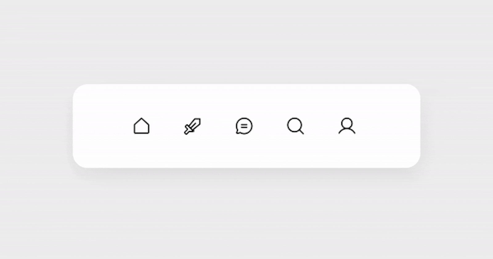


Are you ready to enhance your web development skills with an exciting project? In today's tutorial, as part of Day 24 of the #100DaysOfCode Challenge, we'll be creating a stylish menubar with a hover reveal effect. This project not only adds visual appeal to your website but also provides a great opportunity to practice CSS and HTML.
Before we dive in, make sure you have the full source code downloaded from the link provided in the #100DaysOfCode Challenge telegram group: Download Full Source Code.
Step 1: Setting Up the Project
First, let's create a new HTML file for our project. We'll name it index.html and set up the basic structure:
<!DOCTYPE html>
<html lang="en">
<head>
    <meta charset="UTF-8">
    <meta name="viewport" content="width=device-width, initial-scale=1.0">
    <link rel="stylesheet" href="styles.css">
    <title>Menubar With Hover Reveal Effect</title>
</head>
<body>
    <!-- Menubar content will go here -->
</body>
</html>
Step 2: Including Stylesheet
We'll create a separate CSS file named styles.css to keep our styles organized. Let's link it in our HTML file:
<link rel="stylesheet" href="styles.css">
Step 3: Writing HTML Structure
Now, let's add the HTML structure for our menubar inside the <body> tag:
<div class="custom-menu">
    <!-- Menu items will be added here -->
</div>
Step 4: Styling the Menubar
In styles.css, we'll start by resetting the default styles and importing the Inter font from Google Fonts. Then, we'll apply styles to the body and the custom menu container:
/* Resetting default styles */
*,
*:after,
*:before {
    box-sizing: border-box;
}

/* Importing Inter font */
@import url("https://fonts.googleapis.com/css2?family=Inter:wght@300;400;500;600;700;800;900&display=swap");

/* Body styles */
body {
    font-family: "Inter", sans-serif;
    line-height: 1.5;
    min-height: 100vh;
    display: flex;
    align-items: center;
    justify-content: center;
    background-color: #eee;
}

/* Custom menu styles */
.custom-menu {
    padding: 2rem;
    background-color: #fff;
    position: relative;
    width: calc(130px + 4 * 70px + 4rem);
    display: flex;
    justify-content: center;
    border-radius: 20px;
    box-shadow: 0 10px 25px 0 rgba(0, 0, 0, 0.075);
}
Step 5: Adding Menu Items
Inside the .custom-menu div, let's add individual links for each menu item:
<a href="#" class="custom-link">
    <span class="custom-link-icon"><!-- SVG icon goes here --></span>
    <span class="custom-link-title">Home</span>
</a>
<!-- Repeat the above code block for other menu items -->
Step 6: Styling Menu Items
Finally, let's style the custom link elements to achieve the hover reveal effect:
/* Custom link styles */
.custom-link {
    display: inline-flex;
    justify-content: center;
    align-items: center;
    width: 70px;
    height: 50px;
    border-radius: 99em;
    position: relative;
    z-index: 1;
    overflow: hidden;
    transform-origin: center left;
    transition: width 0.2s ease-in;
    text-decoration: none;
    color: inherit;
}

/* Styles for pseudo-element before */
.custom-link:before {
    position: absolute;
    z-index: -1;
    content: "";
    display: block;
    border-radius: 99em;
    width: 100%;
    height: 100%;
    top: 0;
    transform: translateX(100%);
    transition: transform 0.2s ease-in;
    transform-origin: center right;
    background-color: #eee;
}

/* Hover and focus styles for custom links */
.custom-link:hover,
.custom-link:focus {
    outline: 0;
    width: 130px;
}

/* Hover and focus styles for pseudo-element before and link title */
.custom-link:hover:before,
.custom-link:hover .custom-link-title,
.custom-link:focus:before,
.custom-link:focus .custom-link-title {
    transform: translateX(0);
    opacity: 1;
}
Step 7: Adding Icons
You can replace <!-- SVG icon goes here --> with SVG icons for each menu item. Make sure to adjust the icon size and position according to your design.
Step 8: Testing
That's it! Save your files and open index.html in your web browser to see the menubar in action. Hover over the menu items to reveal the effect.
Congratulations on completing Day 24 of the #100DaysOfCode Challenge with this awesome project! Don't forget to share your creation on social media and tag me at Bento.me. Keep coding and stay tuned for more exciting projects in the challenge!