

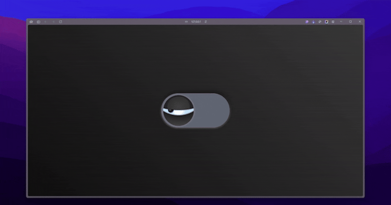


Welcome to the world of captivating web design! In this article, we'll dive into the creation of an Animated Eye Toggle, a visually striking and interactive element that can add a touch of playfulness and personality to your web projects.
Step 1: Set up the HTML Structure
The foundation of our Animated Eye Toggle lies in the HTML structure. Let's start by creating a basic HTML document with the necessary elements:
<!DOCTYPE html>
<html lang="en">
<head>
    <meta charset="UTF-8">
    <meta name="viewport" content="width=device-width, initial-scale=1.0">
    <link rel="stylesheet" href="style.css">
    <title>Animated Eye Toggle</title>
</head>
<body>
    <div class="content">
        <input type="checkbox" id="btn">
        <label for="btn">
            <span class="track"></span>
            <span class="thumb">
                <span class="eye"></span>
            </span>
        </label>
    </div>
</body>
</html>
In this HTML structure, we have a <div> with the class "content" that serves as the container for our Animated Eye Toggle. Inside this container, we have an <input> element of type "checkbox" with the ID "btn", and a <label> element that is associated with the checkbox.
Within the <label>, we have two <span> elements: one with the class "track" and another with the class "thumb". The "thumb" <span> also contains a nested <span> element with the class "eye".
This structure sets the stage for the CSS magic that will bring our Animated Eye Toggle to life.
Step 2: Style the Animated Eye Toggle with CSS
Now, let's dive into the CSS that will transform our HTML structure into a visually captivating Animated Eye Toggle. We'll start by defining some custom CSS variables to control the size and colors of the elements:
:root {
    --sz: 10vmin; /* size */
    --on: #269fe5; /* color on */
    --of: #616774; /* color off */
    --tr: all 0.25s ease 0s;
}
Next, we'll style the overall layout and appearance of the Animated Eye Toggle:
* {
    box-sizing: border-box;
    transition: var(--tr);
}

body {
    margin: 0;
    padding: 0;
    width: 100vw;
    height: 100vh;
    overflow: hidden;
    display: flex;
    align-items: center;
    justify-content: center;
    background: linear-gradient(45deg, #101010, #393939);
}

.content {
    position: relative;
    width: calc(var(--sz) * 4);
    height: calc(var(--sz) * 2);
    display: flex;
    align-items: center;
    justify-content: center;
}

input {
    display: none;
}
Now, let's style the label and the track:
label[for="btn"] {
    position: absolute;
    width: calc(var(--sz) * 4);
    height: calc(var(--sz) * 2);
    background: var(--of);
    border-radius: var(--sz);
    box-shadow: 0 0 calc(var(--sz) / 50) calc(var(--sz) / 50) #0006,
                0 -4px calc(var(--sz) / 10) calc(var(--sz) / 500) #000d,
                0 0px calc(var(--sz) / 10) calc(var(--sz) / 50) #fff8,
                0 -4px calc(var(--sz) / 5) calc(var(--sz) / 50) #000c;
}

.track {
    position: absolute;
    width: 100%;
    height: 100%;
    border-radius: var(--sz);
    overflow: hidden;
}

.track:before {
    content: "";
    position: absolute;
    width: 200%;
    height: 100%;
    left: -100%;
    transition: var(--tr);
    background: linear-gradient(90deg, var(--on) 50%, var(--of) 50%);
    animation: move-color 3s ease 0s 1;
}

#btn:checked + label .track:before {
    left: 0%;
}
Next, let's style the thumb and the eye:
.thumb {
    position: absolute;
    width: calc(calc(var(--sz) * 2) - calc(var(--sz) / 5));
    height: calc(calc(var(--sz) * 2) - calc(var(--sz) / 5));
    top: calc(calc(var(--sz) / 10) + calc(var(--sz) / 200));
    left: calc(calc(var(--sz) / 10) + calc(var(--sz) / 100));
    /* Thumb styles */
    border-radius: var(--sz);
    cursor: pointer;
    display: flex;
    align-items: center;
    justify-content: center;
    z-index: 1;
    overflow: hidden;
    animation: move-thumb 3s ease 0s 1;
}

#btn:checked + label .thumb {
    left: calc(calc(100% - calc(calc(var(--sz) * 2) - calc(var(--sz) / 3))) - calc(calc(var(--sz) / 10) + calc(var(--sz) / 7)));
}

.eye {
    position: absolute;
    width: calc(var(--sz) / 3);
    height: calc(var(--sz) / 3.1);
    background: radial-gradient(circle at 36% 35%, #8d8d8d 1px, #000 calc(var(--sz) / 8), var(--on));
    z-index: -2;
    border-radius: 100%;
    top: calc(var(--sz) / 1.4);
    left: calc(var(--sz) / 3.5);
    filter: blur(0.5px);
    animation: move-eye 3s ease 0s 1;
}

#btn:checked + label .thumb .eye {
    top: calc(var(--sz) / 2.25);
    left: calc(var(--sz) / 0.825);
}
Finally, let's add the animations to bring the Animated Eye Toggle to life:
@keyframes move-thumb {
    /* Animation for the thumb */
}

@keyframes move-color {
    /* Animation for the track color */
}

@keyframes move-eye {
    /* Animation for the eye */
}

@keyframes move-eyelid-top {
    /* Animation for the top eyelid */
}

@keyframes move-eyelid-bot {
    /* Animation for the bottom eyelid */
}
By combining these CSS styles and animations, you've created a captivating Animated Eye Toggle that can add a touch of interactivity and personality to your web projects.
Conclusion
This CSS project is a fantastic example of the creative potential of CSS. By combining thoughtful design, strategic positioning, and well-crafted animations, the developer has created a visually striking and interactive eye toggle that is sure to impress.
Download the Full Source Code
For download the full source code, please click this link:https://t.me/CodeWithAarzoo.
Connect with Me on Social Media
If you want to connect with me on social media for updates, please visit this link: bento.me/withaarzoo.