

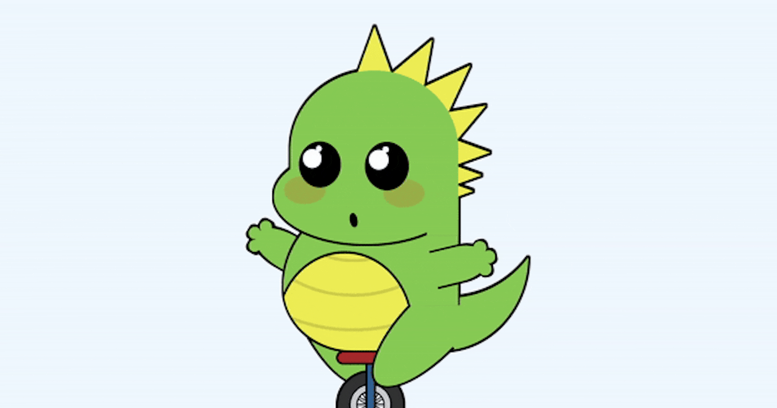


Welcome to Day 16 of the #100DaysOfCode Challenge! Today, we're diving into a fun and whimsical project: creating an animated dinosaur riding a unicycle using HTML and CSS. Follow along as we break down the step-by-step process to bring this playful animation to life.
Step 1
Download the Source Code
To get started, download the full source code for this project from here. Once you have the source code downloaded, unzip the file and open it in your favorite text editor or integrated development environment (IDE).
Step 2
Set Up the HTML Structure
Open the index.html file from the downloaded source code. We'll begin by setting up the HTML structure for our animated dinosaur. Here's a basic outline:
<!DOCTYPE html>
<html lang="en">

<head>
    <!-- Set character encoding and define viewport -->
    <meta charset="UTF-8">
    <meta http-equiv="X-UA-Compatible" content="IE=edge">
    <meta name="viewport" content="width=device-width, initial-scale=1.0">

    <!-- Link external stylesheet -->
    <link rel="stylesheet" href="style.css">

    <!-- Title of the webpage -->
    <title>Animated Dinosaur on a Unicycle</title>
</head>

<body>
    <!-- Main content of the webpage -->
    <article>
        <!-- Dinosaur's arm -->
        <div class="arm"></div>

        <!-- Dinosaur's leg -->
        <div class="leg"></div>

        <!-- Section for the body of the dinosaur -->
        <section class="body">
            <!-- Chest and tail -->
            <div class="chest"></div>
            <div class="tail"></div>
        </section>

        <!-- Section for the head of the dinosaur -->
        <section class="head">
            <!-- Spikes on the dinosaur's head -->
            <div class="spike"></div>
            <div class="spike"></div>
            <div class="spike"></div>
            <div class="spike"></div>
            <div class="spike"></div>
            <div class="spike"></div>
            <div class="spike"></div>

            <!-- Face of the dinosaur -->
            <div class="face">
                <div class="drop"></div> <!-- Drop-like feature -->
                <div class="cheek"></div> <!-- Cheeks -->
                <div class="cheek"></div>
                <div class="eye"></div> <!-- Eyes -->
                <div class="eye"></div>
                <div class="mouth"></div> <!-- Mouth -->
                <div class="nose"></div> <!-- Nose -->
            </div>
        </section>

        <!-- Section for additional features -->
        <section class="i-hate-corrections">
            <div class="neck"></div> <!-- Neck -->
            <div class="back"></div> <!-- Back -->
        </section>

        <!-- Unicycle for the dinosaur -->
        <div class="unicycle">
            <div class="wheel"></div> <!-- Wheel -->
            <div class="frame"></div> <!-- Frame -->
            <div class="seat"></div> <!-- Seat -->
        </div>

        <!-- Another leg of the dinosaur -->
        <div class="leg"></div>

        <!-- Another arm of the dinosaur -->
        <div class="arm"></div>
    </article>
</body>

</html>
Step 3
Style the Dinosaur with CSS
Next, let's move to the style.css file to add styles for our animated dinosaur. We'll use CSS to position and animate different parts of the dinosaur, such as its arms, legs, tail, and facial features. Here's a snippet of the CSS code:
/* Disable all animations on every element */
/* * { animation: none !important; } */

/* Define animation for movement */
@keyframes move {

    0%,
    100% {
        transform: translate(-50%, 0) rotate(0);
    }

    25% {
        transform: translate(-56%, 0) rotate(2deg);
    }

    75% {
        transform: translate(-44%, 0) rotate(-2deg);
    }
}

/* Style for the main content */
article {
    animation: move 4s infinite;
    --skin: #8c5;
    --skin2: #ee5;
    position: absolute;
    bottom: 4vmin;
    left: 50%;
    transform: translate(-50%, 0%);
    width: 80vmin;
    height: 80vmin;
    transform-origin: 50% 96%;
}

/* Style for all elements within the article */
article *,
article *::before,
article *::after {
    position: absolute;
    box-sizing: border-box;
}

/* Style for the head section of the dinosaur */
.head {
    width: 60%;
    height: 50%;
    top: 0;
    left: 40%;
    transform: translateX(-50%);
    filter: drop-shadow(-0.15vmin -0.25vmin) drop-shadow(0.15vmin -0.25vmin) drop-shadow(0 -0.125vmin) drop-shadow(0 0.5vmin) drop-shadow(-0.25vmin 0) drop-shadow(0.35vmin 0);
}

/* Style for the face of the dinosaur */
.face {
    width: 80%;
    height: 90%;
    border-radius: 100% 100% 60% 60%;
    background: var(--skin);
    right: 0;
}

/* Pseudo-element for the face */
.face::before {
    content: "";
    width: 110%;
    height: 60%;
    background: var(--skin);
    top: 50%;
    right: 0;
    border-radius: 100% 0 100% 100%;
}

/* Style for the eyes of the dinosaur */
.eye {
    width: 25%;
    background:
        /* radial-gradient( at 30% 35%, #fff 20%, #0000 21%), */
        /* radial-gradient(circle at 50% 15%, #fff 5%, #0000 5.5%) */
        #000;
    aspect-ratio: 1 / 1.1;
    border-radius: 50%;
    top: 45%;
    left: 5%;
}

/* Animation for eye movement */
@keyframes moveEye {
    0% {
        transform: scale(1);
    }

    100% {
        transform: scale(0.94);
    }
}

/* Pseudo-element for the eye */
.eye::before {
    animation: moveEye 1.5s alternate infinite;
    content: "";
    width: 45%;
    aspect-ratio: 1;
    background: #fff;
    top: 17%;
    left: 9%;
    border-radius: 50%;
}

/* Pseudo-element for the eye */
.eye::after {
    animation: moveEye 1.5s 0.75s alternate infinite;
    content: "";
    width: 15%;
    aspect-ratio: 1;
    background: #fff;
    top: 9%;
    left: 40%;
    border-radius: 50%;
}

/* Second eye styling */
.eye+.eye {
    left: 45%;
    top: 46%;
    transform: scale(1.05);
}

/* Style for the cheeks of the dinosaur */
.cheek {
    width: 25%;
    height: 18%;
    background: repeating-linear-gradient(-40deg, #0000 0 17%, #f001 0 21%), #f002;
    border: 1vmin solid #0000;
    background-clip: content-box, border-box;
    border-radius: 50%;
    top: 67%;
    left: -4%;
    filter: blur(0.1vmin);
}

/* Second cheek styling */
.cheek+.cheek {
    left: 55%;
    top: 69%;
}

/* Style for the spikes on the dinosaur's head */
.spike {
    width: 30%;
    aspect-ratio: 1;
    background: conic-gradient(at 50% 0,
            #0000 160deg,
            var(--skin2) 0 200deg,
            #0000 0);
    top: -25%;
    left: 45%;
}

/* Additional styling for specific spikes */
.spike:nth-child(2) {
    transform: rotate(30deg);
    left: 65%;
    top: -20%;
}

.spike:nth-child(3) {
    transform: rotate(45deg);
    left: 80%;
    top: -8%;
}

.spike:nth-child(4) {
    transform: rotate(60deg);
    left: 85%;
    top: 11%;
}

.spike:nth-child(5) {
    transform: rotate(90deg);
    left: 85%;
    top: 29%;
}

.spike:nth-child(6) {
    transform: rotate(90deg);
    left: 81%;
    top: 42%;
}

.spike:nth-child(7) {
    transform: rotate(90deg);
    left: 77%;
    top: 51%;
}

/* Animation for the drop */
@keyframes drop {
    0% {
        opacity: 0;
        transform: rotate(45deg) translate(0, 0);
    }

    10%,
    20% {
        opacity: 1;
        transform: rotate(45deg) translate(0, 0);
    }

    50%,
    100% {
        opacity: 0;
        transform: rotate(45deg) translate(100%, 100%);
    }
}

/* Style for the drop */
.drop {
    animation: drop 5s infinite;
    width: 18%;
    aspect-ratio: 1;
    background: radial-gradient(circle at 40% 70%, #fff 20%, #0000 0), #8ef;
    border-radius: 0 100% 100% 100%;
    transform: rotate(45deg);
    border: 0.65vmin solid;
    left: 75%;
    top: 25%;
}

/* Animation for mouth movement */
@keyframes moveMouth {

    0%,
    100% {
        transform: rotate(-10deg) scale(1);
    }

    33% {
        transform: rotate(-10deg) scale(1.1);
    }

    66% {
        transform: rotate(-10deg) scale(0.9);
    }
}

/* Style for the mouth */
.mouth {
    animation: moveMouth 2.75s linear infinite;
    width: 5%;
    height: 10%;
    background: black;
    border-radius: 50%;
    top: 90%;
    left: 35%;
    transform: rotate(-10deg);
}

/* .mouth {
    width: 15%;
    aspect-ratio: 2;
    background:
        radial-gradient(farthest-side at 50% 0, #0000 80%, #000 0);
    top: 80%;
    left: 29%;
    border-radius: 50% / 0 0 100% 100%;
} */

/* .mouth {
    width: 40%;
    height: 9%;
    background: #000;
    bottom: 0%;
    left: 30%;
    border-radius: 50% / 0 100% 100% 200%;
}

.mouth::before {
    content: "";
    width: 80%;
    top: 0.5vmin;
    left: 5%;
    height: 2vmin;
    background: yellow;
    clip-path: polygon(0 0, 100% 0, 83.333% 100%, 66.66% 0, 50% 100%, 33.33% 0, 16.66% 100%)
} */

/* Style for the body section of the dinosaur */
.body {
    width: 50%;
    height: 45%;
    top: 35%;
    left: 45%;
    transform: translateX(-50%);
    filter: drop-shadow(-0.15vmin -0.25vmin) drop-shadow(0.15vmin -0.25vmin) drop-shadow(0 -0.125vmin) drop-shadow(0 0.5vmin) drop-shadow(-0.25vmin 0) drop-shadow(0.35vmin 0);
}

/* Style for the chest of the dinosaur */
.chest {
    top: 0;
    left: 0;
    width: 100%;
    height: 100%;
    border-radius: 150% 0 50% 100%;
    background: radial-gradient(130% 160% at 35% 85%,
            #0000 29%,
            #000 29.1% 30%,
            var(--skin) 30.1%),
        repeating-radial-gradient(100% 100% at 40% 0, #0000 0 20%, #0002 0 22%),
        var(--skin2);
}

/* Animation for tail movement */
@keyframes moveTail {
    0% {
        transform: rotate(0);
    }

    100% {
        transform: rotate(3deg);
    }
}

/* Style for the tail of the dinosaur */
.tail {
    animation: moveTail 3s alternate ease-in infinite;
    width: 50%;
    height: 60%;
    bottom: -0.25%;
    left: 90%;
    transform-origin: 0 100%;
    border-radius: 0 0 100% 0;
    box-shadow: inset 2vmin -15vmin 0 -3vmin var(--skin);
}
Step 4
Add Animation Keyframes
To make our dinosaur come to life, we'll define keyframe animations for various movements and expressions. These animations will be applied to different elements of the dinosaur, such as its arms waving, legs moving, and facial features changing. Here's an example of keyframe animations for waving the arms:
/* Animation for waving the first arm */
@keyframes waveArm1 {

    0%,
    100% {
        transform: rotate(30deg);
    }

    50% {
        transform: rotate(35deg);
    }
}

/* Style for the first arm of the dinosaur */
.arm {
    animation: waveArm1 2s infinite;
    width: 20%;
    height: 10%;
    background: var(--skin);
    border-radius: 120% / 100% 0 0 100%;
    transform: rotate(30deg);
    transform-origin: 100% 50%;
    top: 52%;
    left: 10%;
    filter: drop-shadow(-0.5vmin 0) drop-shadow(0 0.5vmin) drop-shadow(0 -0.5vmin) drop-shadow(0.65vmin 0);
}

/* Pseudo-element for the first arm */
.arm::before {
    content: "";
    color: var(--skin);
    width: 17%;
    aspect-ratio: 1;
    background: var(--skin);
    border-radius: 50%;
    left: 0;
    top: 50%;
    transform: translate(-80%, -50%);
    box-shadow: 1.5vmin -2.5vmin, 1.5vmin 2.5vmin;
}

/* Animation for waving the second arm */
@keyframes waveArm2 {

    0%,
    100% {
        transform: rotate(-190deg);
    }

    50% {
        transform: rotate(-200deg);
    }
}

/* Style for the second arm of the dinosaur */
.arm~.arm {
    animation: waveArm2 2.33s reverse infinite;
    width: 15%;
    transform: rotate(-190deg);
    filter: drop-shadow(-0.5vmin 0) drop-shadow(0 0.5vmin) drop-shadow(0 -0.5vmin);
    left: 48%;
}

/* Additional styling for the second arm */
.arm~.arm::before {
    width: 25%;
}

/* Animation for moving the first leg */
@keyframes moveLeg1 {

    0%,
    100% {
        transform: rotate(-25deg);
    }

    50% {
        transform: rotate(-28deg);
    }
}

/* Style for the first leg of the dinosaur */
.leg {
    animation: moveLeg1 3.33s linear infinite;
    transform-origin: 50% 0;
    width: 18%;
    height: 23%;
    background: var(--skin);
    border-radius: 50% / 0 0 100% 100%;
    top: 69%;
    left: 24%;
    transform: rotate(-25deg);
    border: 0.6vmin solid;
    border-top: 0;
}

/* Animation for moving the second leg */
@keyframes moveLeg2 {

    0%,
    100% {
        transform: rotate(45deg);
    }

    50% {
        transform: rotate(43deg);
    }
}

/* Style for the second leg of the dinosaur */
.leg~.leg {
    animation: moveLeg2 3.33s linear infinite;
    top: 73%;
    left: 53.5%;
    transform: rotate(45deg);
}

/* Style for the unicycle */
.unicycle {
    width: 20%;
    height: 20%;
    bottom: 0;
    left: 45%;
    transform: translate(-50%, 0);
}

/* Style for the seat of the unicycle */
.seat {
    width: 100%;
    height: 20%;
    border: 0.5vmin solid;
    background: brown;
    border-radius: 5vmin;
}

/* Style for the frame of the unicycle */
.frame {
    width: 15%;
    height: 86%;
    left: 50%;
    transform: translate(-50%, 0);
    border: 0.5vmin solid;
    border-radius: 1vmin;
    background: linear-gradient(#0002, #0000), #369;
}

/* Animation for rotating the wheel */
@keyframes rotateWheel {

    0%,
    100% {
        transform: translate(-50%, 0) rotate(0);
    }

    25% {
        transform: translate(-50%, 0) rotate(-30deg);
    }

    75% {
        transform: translate(-50%, 0) rotate(30deg);
    }
}

/* Style for the wheel of the unicycle */
.wheel {
    animation: rotateWheel 4s infinite;
    width: 100%;
    aspect-ratio: 1;
    background: radial-gradient(farthest-side,
            #0000 40%,
            #000 0 44%,
            #ccc 0 61%,
            #000 0 65%,
            #333 0),
        linear-gradient(30deg,
            #0000 48%,
            #000 0 49%,
            #ccc 0 51%,
            #000 0 52%,
            #0000 0),
        linear-gradient(60deg,
            #0000 48%,
            #000 0 49%,
            #ccc 0 51%,
            #000 0 52%,
            #0000 0),
        linear-gradient(90deg,
            #0000 48%,
            #000 0 49%,
            #ccc 0 51%,
            #000 0 52%,
            #0000 0),
        linear-gradient(120deg,
            #0000 48%,
            #000 0 49%,
            #ccc 0 51%,
            #000 0 52%,
            #0000 0),
        linear-gradient(150deg,
            #0000 48%,
            #000 0 49%,
            #ccc 0 51%,
            #000 0 52%,
            #0000 0),
        linear-gradient(180deg,
            #0000 48%,
            #000 0 49%,
            #ccc 0 51%,
            #000 0 52%,
            #0000 0);
    top: 28%;
    left: 50%;
    transform: translateX(-50%);
    border: 0.6vmin solid;
    border-radius: 50%;
}

/* Style for the section containing corrections */
.i-hate-corrections {
    width: 100%;
    height: 100%;
    top: 0;
    left: 0;
}

/* Style for the neck of the dinosaur */
.neck {
    width: 9%;
    height: 20%;
    background: var(--skin);
    top: 35%;
    right: 30%;
}

/* Style for the back of the dinosaur */
.back {
    width: 10%;
    height: 20%;
    top: 47%;
    right: 30%;
    box-shadow: 0.35vmin 0;
}

/* General body background */
body {
    background: aliceblue;
}
Step 5
Customize and Experiment
Feel free to customize the code further to add your own creative touches or make adjustments to fit your specific requirements. Experiment with different CSS properties, animations, and positioning to create a unique and captivating animation.
Step 6
Run Your Code
Once you're satisfied with the changes, save your files and run the index.html file in your web browser. You should see your animated dinosaur riding a unicycle come to life right before your eyes!
Step 7
Connect with Me
If you have any questions, or feedback, or just want to connect, don't hesitate to reach out to me:
- Website: https://bento.me/withaarzoo
That's it for Day 16 of the #100DaysOfCode Challenge! I hope you enjoyed creating this fun and playful animation. Stay tuned for more coding adventures ahead! 🦖🚲✨