


Introduction
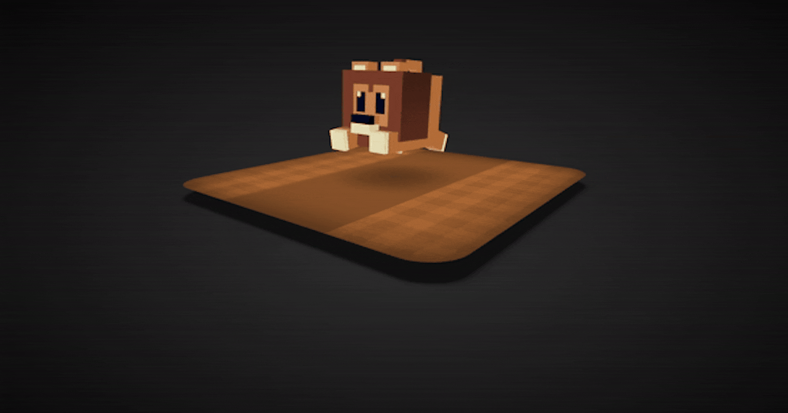
Welcome back to Day 27 of the #100DaysOfCode Challenge! Today, we're going to dive into creating a fun and adorable project: an animated cute lion using HTML and CSS. This project will not only add a touch of creativity to your coding journey but also help you enhance your skills in HTML and CSS animation.
Before We Begin
Before we dive into the coding process, make sure you have a text editor installed on your system. You can use any text editor of your choice, such as Visual Studio Code, Sublime Text, or Atom. Once you have your text editor ready, let's get started!
Step 1: Setting Up Your HTML Structure
Open your text editor and create a new HTML file. We'll name it "index.html". Start by defining the basic structure of your HTML document by typing the following code:
<!DOCTYPE html>
<html lang="en">

<head>
    <meta charset="UTF-8">
    <meta name="viewport" content="width=device-width, initial-scale=1.0">
    <link rel="stylesheet" href="style.css">
    <title>3D Cute Lion</title>
</head>

<body>
    <!-- Main scene container -->
    <div class="scene">
        <!-- Ground plane -->
        <div class="cube" id="ground">
            <div class="container">
                <div class="left"></div>
                <div class="right"></div>
                <div class="top"></div>
                <div class="bottom"></div>
                <div class="front"></div>
                <div class="back"></div>
            </div>
        </div>
        <!-- Lion model -->
        <div class="lion">
            <div class="body _face">
                <!-- Lion body -->
                <div class="cube" id="body">
                    <div class="container">
                        <div class="left"></div>
                        <div class="right"></div>
                        <div class="top"></div>
                        <div class="bottom"></div>
                        <div class="front"></div>
                        <div class="back"></div>
                    </div>
                </div>
                <!-- Lion mane -->
                <div class="mane _face">
                    <div class="cube" id="mane">
                        <div class="container">
                            <div class="left"></div>
                            <div class="right"></div>
                            <div class="top"></div>
                            <div class="bottom"></div>
                            <div class="front"></div>
                            <div class="back"></div>
                        </div>
                    </div>
                    <div class="cube" id="mane-lower">
                        <div class="container">
                            <div class="left"></div>
                            <div class="right"></div>
                            <div class="top"></div>
                            <div class="bottom"></div>
                            <div class="front"></div>
                            <div class="back"></div>
                        </div>
                    </div>
                </div>
                <!-- Lion ears -->
                <div class="ears _face">
                    <div class="cube" id="ear-left">
                        <div class="container">
                            <div class="left"></div>
                            <div class="right"></div>
                            <div class="top"></div>
                            <div class="bottom"></div>
                            <div class="front"></div>
                            <div class="back"></div>
                        </div>
                    </div>
                    <div class="cube" id="ear-right">
                        <div class="container">
                            <div class="left"></div>
                            <div class="right"></div>
                            <div class="top"></div>
                            <div class="bottom"></div>
                            <div class="front"></div>
                            <div class="back"></div>
                        </div>
                    </div>
                </div>
                <!-- Lion nose -->
                <div class="nose _face">
                    <div class="cube" id="nose-top-back">
                        <div class="container">
                            <div class="left"></div>
                            <div class="right"></div>
                            <div class="top"></div>
                            <div class="bottom"></div>
                            <div class="front"></div>
                            <div class="back"></div>
                        </div>
                    </div>
                    <div class="cube" id="nose-top-front">
                        <div class="container">
                            <div class="left"></div>
                            <div class="right"></div>
                            <div class="top"></div>
                            <div class="bottom"></div>
                            <div class="front"></div>
                            <div class="back"></div>
                        </div>
                    </div>
                    <div class="cube" id="nose-bottom">
                        <div class="container">
                            <div class="left"></div>
                            <div class="right"></div>
                            <div class="top"></div>
                            <div class="bottom"></div>
                            <div class="front"></div>
                            <div class="back"></div>
                        </div>
                    </div>
                </div>
                <!-- Lion tail -->
                <div class="tail _face">
                    <div class="cube" id="tail-bottom">
                        <div class="container">
                            <div class="left"></div>
                            <div class="right"></div>
                            <div class="top"></div>
                            <div class="bottom"></div>
                            <div class="front"></div>
                            <div class="back"></div>
                        </div>
                    </div>
                    <div class="cube" id="tail-top-back">
                        <div class="container">
                            <div class="left"></div>
                            <div class="right"></div>
                            <div class="top"></div>
                            <div class="bottom"></div>
                            <div class="front"></div>
                            <div class="back"></div>
                        </div>
                    </div>
                    <div class="cube" id="tail-top-front">
                        <div class="container">
                            <div class="left"></div>
                            <div class="right"></div>
                            <div class="top"></div>
                            <div class="bottom"></div>
                            <div class="front"></div>
                            <div class="back"></div>
                        </div>
                    </div>
                </div>
                <!-- Lion legs -->
                <div class="legs _face">
                    <div class="leg-left-front _face">
                        <div class="cube" id="leg-left-front">
                            <div class="container">
                                <div class="left"></div>
                                <div class="right"></div>
                                <div class="top"></div>
                                <div class="bottom"></div>
                                <div class="front"></div>
                                <div class="back"></div>
                            </div>
                        </div>
                    </div>
                    <div class="leg-right-front _face">
                        <div class="cube" id="leg-right-front">
                            <div class="container">
                                <div class="left"></div>
                                <div class="right"></div>
                                <div class="top"></div>
                                <div class="bottom"></div>
                                <div class="front"></div>
                                <div class="back"></div>
                            </div>
                        </div>
                    </div>
                    <div class="leg-left-back _face">
                        <div class="cube" id="leg-left-back">
                            <div class="container">
                                <div class="left"></div>
                                <div class="right"></div>
                                <div class="top"></div>
                                <div class="bottom"></div>
                                <div class="front"></div>
                                <div class="back"></div>
                            </div>
                        </div>
                    </div>
                    <div class="leg-right-back _face">
                        <div class="cube" id="leg-right-back">
                            <div class="container">
                                <div class="left"></div>
                                <div class="right"></div>
                                <div class="top"></div>
                                <div class="bottom"></div>
                                <div class="front"></div>
                                <div class="back"></div>
                            </div>
                        </div>
                    </div>
                </div>
            </div>
        </div>
    </div>
</body>

</html>
In this code, we've created a basic HTML structure with a container div for our lion.
Step 2: Styling the Lion with CSS
Now, let's move on to styling our lion using CSS. Create a new CSS file named "styles.css" in the same directory as your HTML file. Add the following code to your CSS file:
* {
    margin: 0;
    padding: 0;
    box-sizing: border-box;
}

body {
    display: grid;
    place-items: center;
    min-height: 100vh;
    background-image: radial-gradient(#333, #0a0a0a);
    overflow: hidden;
    perspective: 1000px;
}

body .scene,
body .scene * {
    transform-style: preserve-3d;
}

body .scene {
    position: relative;
    width: 70vmin;
    height: 20vmin;
    transform: rotateX(-20deg) rotateY(50deg);
    animation: rot 30s ease-in-out 0s infinite alternate;
}

@keyframes rot {
    to {
        transform: rotateX(0deg) rotateY(440deg);
    }
}

body .scene::after {
    content: "";
    position: absolute;
    width: 100%;
    height: 100%;
    left: 0;
    top: 0;
    z-index: -100;
    transform: rotateX(90deg) scale(1);
}

body .scene .cube,
body .scene .cube *,
body .scene .lion,
body .scene .lion * {
    position: absolute;
    bottom: 0;
}

body .scene #ground {
    z-index: -50;
    width: 70vmin;
    height: 3vmin;
    transform: translateY(3vmin);
}

body .scene #ground .container {
    position: relative;
    width: 100%;
    height: 100%;
}

body .scene #ground .container * {
    position: absolute;
    bottom: 0;
    display: flex;
    justify-content: center;
    align-items: center;
}

body .scene #ground .container .left {
    width: 70vmin;
    height: 3vmin;
    background-color: #9a5e30;
    transform-origin: left top;
    transform: rotateY(-90deg) translateX(-35vmin);
}

body .scene #ground .container .right {
    width: 70vmin;
    height: 3vmin;
    background-color: #9a5e30;
    transform-origin: left top;
    transform: rotateY(90deg) translateX(-35vmin) translateZ(70vmin);
}

body .scene #ground .container .top {
    background-color: #ae6a36;
    width: 70vmin;
    height: 70vmin;
    transform-origin: bottom left;
    transform: rotateX(90deg) translateY(35vmin) translateZ(3vmin);
}

body .scene #ground .container .bottom {
    background-color: #ae6a36;
    width: 70vmin;
    height: 70vmin;
    transform-origin: bottom left;
    transform: rotateX(-90deg) translateY(35vmin);
}

body .scene #ground .container .front {
    background-color: #7b4b27;
    width: 70vmin;
    height: 3vmin;
    transform-origin: bottom left;
    transform: translateZ(35vmin);
}

body .scene #ground .container .back {
    background-color: #7b4b27;
    width: 70vmin;
    height: 3vmin;
    transform-origin: center;
    transform: rotateY(180deg) translateZ(35vmin) rotateX(180deg) rotateZ(180deg);
}

body .scene #ground .container .left,
body .scene #ground .container .right,
body .scene #ground .container .front,
body .scene #ground .container .back {
    display: none;
}

body .scene #ground .container .bottom {
    filter: drop-shadow(0 0 0.75vmin black);
    background: #111;
    border-radius: 10%;
}

body .scene #ground .container .top {
    box-shadow: inset 0 0 15vmin #000a;
    border-radius: 10%;
    background-image: radial-gradient(#0004, #0000 15vmin), linear-gradient(to bottom, #0000 30%, #87522a 30% 70%, #0000 70% 100%), repeating-linear-gradient(180deg, #0000 0% 50%, #0001 50% 100%), repeating-linear-gradient(90deg, #0000 0% 50%, #0001 50% 100%);
    background-size: 100%, 100%, 8vmin 8vmin, 8vmin 8vmin;
    animation: floorMove 0.2s infinite linear;
}

@keyframes floorMove {
    to {
        background-position-x: center, center, 8vmin, 8vmin;
    }
}

body .scene #ground .container .top::after {
    content: "";
    position: absolute;
    width: 25%;
    height: 25%;
    background: #0001;
    box-shadow: 0 0 8vmin #0002;
    animation: scaleShadow 0.3s linear 0.35s infinite alternate;
}

@keyframes scaleShadow {
    from {
        transform: scale(0.8);
    }

    to {
        transform: scale(1);
    }
}

body .scene .lion {
    position: absolute;
    width: 15vmin;
    height: 15vmin;
    bottom: 0;
    transform-origin: 7.5vmin 7.5vmin;
    transform: translate3d(27vmin, -4vmin, 0vmin);
    animation: animate-lion 0.6s ease-in-out infinite;
}

@keyframes animate-lion {

    0%,
    100% {
        transform: translate3d(27vmin, -4vmin, 0vmin);
    }

    33% {
        transform: translate3d(27vmin, -8vmin, 0vmin) rotateZ(10deg) rotateX(-5deg);
    }

    66% {
        transform: translate3d(27vmin, -7vmin, 0vmin) rotateZ(-10deg) rotateX(5deg);
    }
}

body .scene .lion ._face {
    position: absolute;
    bottom: 0;
}

body .scene .lion .body {
    width: 15vmin;
    height: 15vmin;
}

body .scene .lion .body #body {
    width: 15vmin;
    height: 15vmin;
    transform: translate3d(0vmin, 0vmin, 0vmin);
}

body .scene .lion .body #body .container {
    position: relative;
    width: 100%;
    height: 100%;
}

body .scene .lion .body #body .container * {
    position: absolute;
    bottom: 0;
    display: flex;
    justify-content: center;
    align-items: center;
}

body .scene .lion .body #body .container .left {
    width: 15vmin;
    height: 15vmin;
    background-color: #C8834F;
    transform-origin: left top;
    transform: rotateY(-90deg) translateX(-7.5vmin);
}

body .scene .lion .body #body .container .right {
    width: 15vmin;
    height: 15vmin;
    background-color: #C8834F;
    transform-origin: left top;
    transform: rotateY(90deg) translateX(-7.5vmin) translateZ(15vmin);
}

body .scene .lion .body #body .container .top {
    background-color: #ce9162;
    width: 15vmin;
    height: 15vmin;
    transform-origin: bottom left;
    transform: rotateX(90deg) translateY(7.5vmin) translateZ(15vmin);
}

body .scene .lion .body #body .container .bottom {
    background-color: #ce9162;
    width: 15vmin;
    height: 15vmin;
    transform-origin: bottom left;
    transform: rotateX(-90deg) translateY(7.5vmin);
}

body .scene .lion .body #body .container .front {
    background-color: #b56e39;
    width: 15vmin;
    height: 15vmin;
    transform-origin: bottom left;
    transform: translateZ(7.5vmin);
}

body .scene .lion .body #body .container .back {
    background-color: #b56e39;
    width: 15vmin;
    height: 15vmin;
    transform-origin: center;
    transform: rotateY(180deg) translateZ(7.5vmin) rotateX(180deg) rotateZ(180deg);
}

body .scene .lion .body #body .container .right {
    background-image: linear-gradient(to top, #0000 2vmin, #783D2A 2vmin, #0000 15vmin), linear-gradient(to bottom, #C8834F 12vmin, transparent 13vmin 15vmin), linear-gradient(to right, transparent 4vmin, #E4DDB7 4vmin 11vmin, transparent 11vmin 15vmin);
}

body .scene .lion .body .mane {
    width: 100%;
    height: 100%;
}

body .scene .lion .body .mane #mane {
    width: 10vmin;
    height: 13.3vmin;
    transform: translate3d(0vmin, -2vmin, 0vmin);
}

body .scene .lion .body .mane #mane .container {
    position: relative;
    width: 100%;
    height: 100%;
}

body .scene .lion .body .mane #mane .container * {
    position: absolute;
    bottom: 0;
    display: flex;
    justify-content: center;
    align-items: center;
}

body .scene .lion .body .mane #mane .container .left {
    width: 16vmin;
    height: 13.3vmin;
    background-color: #783D2A;
    transform-origin: left top;
    transform: rotateY(-90deg) translateX(-8vmin);
}

body .scene .lion .body .mane #mane .container .right {
    width: 16vmin;
    height: 13.3vmin;
    background-color: #783D2A;
    transform-origin: left top;
    transform: rotateY(90deg) translateX(-8vmin) translateZ(10vmin);
}

body .scene .lion .body .mane #mane .container .top {
    background-color: #8b4731;
    width: 10vmin;
    height: 16vmin;
    transform-origin: bottom left;
    transform: rotateX(90deg) translateY(8vmin) translateZ(13.3vmin);
}

body .scene .lion .body .mane #mane .container .bottom {
    background-color: #8b4731;
    width: 10vmin;
    height: 16vmin;
    transform-origin: bottom left;
    transform: rotateX(-90deg) translateY(8vmin);
}

body .scene .lion .body .mane #mane .container .front {
    background-color: #5a2e1f;
    width: 10vmin;
    height: 13.3vmin;
    transform-origin: bottom left;
    transform: translateZ(8vmin);
}

body .scene .lion .body .mane #mane .container .back {
    background-color: #5a2e1f;
    width: 10vmin;
    height: 13.3vmin;
    transform-origin: center;
    transform: rotateY(180deg) translateZ(8vmin) rotateX(180deg) rotateZ(180deg);
}

body .scene .lion .body .mane #mane .container .front,
body .scene .lion .body .mane #mane .container .back {
    background-image: linear-gradient(to bottom, #3f2016 0%, #0000 100%);
}

body .scene .lion .body .mane #mane .container .top {
    background-image: linear-gradient(to bottom, #3f2016 0%, #783D2A 50%, #3f2016 100%);
}

body .scene .lion .body .mane #mane .container .left::after {
    content: "";
    position: absolute;
    width: 60%;
    height: 60%;
    background-image: linear-gradient(to right, transparent 43%, #783D2A 43% 57%, transparent 57% 100%), linear-gradient(to bottom, #C8834F 1.5vmin, transparent 1.5vmin 100%), linear-gradient(to right, transparent 1vmin, #E4DDB7 1vmin 2vmin, transparent 2vmin 7.6vmin, #E4DDB7 7.6vmin 8.6vmin, transparent 8.6vmin 9.6vmin), linear-gradient(to bottom, #C8834F 15%, transparent 15% 70%, #C8834F 70% 100%), linear-gradient(to right, #C8834F 10%, #060B21 10% 35%, #C8834F 35% 65%, #060B21 65% 90%, #C8834F 90% 100%);
    background-size: 9.6vmin 1.5vmin, 100%, 100% 2.5vmin, 100%, 100%;
    background-repeat: no-repeat;
}

body .scene .lion .body .mane #mane-lower {
    width: 1vmin;
    height: 2vmin;
    transform: translate3d(0vmin, 0vmin, 0vmin);
}

body .scene .lion .body .mane #mane-lower .container {
    position: relative;
    width: 100%;
    height: 100%;
}

body .scene .lion .body .mane #mane-lower .container * {
    position: absolute;
    bottom: 0;
    display: flex;
    justify-content: center;
    align-items: center;
}

body .scene .lion .body .mane #mane-lower .container .left {
    width: 15vmin;
    height: 2vmin;
    background-color: #783D2A;
    transform-origin: left top;
    transform: rotateY(-90deg) translateX(-7.5vmin);
}

body .scene .lion .body .mane #mane-lower .container .right {
    width: 15vmin;
    height: 2vmin;
    background-color: #783D2A;
    transform-origin: left top;
    transform: rotateY(90deg) translateX(-7.5vmin) translateZ(1vmin);
}

body .scene .lion .body .mane #mane-lower .container .top {
    background-color: #8b4731;
    width: 1vmin;
    height: 15vmin;
    transform-origin: bottom left;
    transform: rotateX(90deg) translateY(7.5vmin) translateZ(2vmin);
}

body .scene .lion .body .mane #mane-lower .container .bottom {
    background-color: #8b4731;
    width: 1vmin;
    height: 15vmin;
    transform-origin: bottom left;
    transform: rotateX(-90deg) translateY(7.5vmin);
}

body .scene .lion .body .mane #mane-lower .container .front {
    background-color: #5a2e1f;
    width: 1vmin;
    height: 2vmin;
    transform-origin: bottom left;
    transform: translateZ(7.5vmin);
}

body .scene .lion .body .mane #mane-lower .container .back {
    background-color: #5a2e1f;
    width: 1vmin;
    height: 2vmin;
    transform-origin: center;
    transform: rotateY(180deg) translateZ(7.5vmin) rotateX(180deg) rotateZ(180deg);
}

body .scene .lion .body .mane #mane-lower .container .left::after {
    content: "";
    width: 7vmin;
    height: 3.5vmin;
    position: absolute;
    background: #783D2A;
    transform: translateY(-0.75vmin);
}

body .scene .lion .body .ears {
    width: 100%;
    height: 100%;
}

body .scene .lion .body .ears #ear-left {
    width: 3vmin;
    height: 2vmin;
    transform: translate3d(1vmin, -15vmin, 4vmin);
}

body .scene .lion .body .ears #ear-left .container {
    position: relative;
    width: 100%;
    height: 100%;
}

body .scene .lion .body .ears #ear-left .container * {
    position: absolute;
    bottom: 0;
    display: flex;
    justify-content: center;
    align-items: center;
}

body .scene .lion .body .ears #ear-left .container .left {
    width: 4.5vmin;
    height: 2vmin;
    background-color: #C8834F;
    transform-origin: left top;
    transform: rotateY(-90deg) translateX(-2.25vmin);
}

body .scene .lion .body .ears #ear-left .container .right {
    width: 4.5vmin;
    height: 2vmin;
    background-color: #C8834F;
    transform-origin: left top;
    transform: rotateY(90deg) translateX(-2.25vmin) translateZ(3vmin);
}

body .scene .lion .body .ears #ear-left .container .top {
    background-color: #ce9162;
    width: 3vmin;
    height: 4.5vmin;
    transform-origin: bottom left;
    transform: rotateX(90deg) translateY(2.25vmin) translateZ(2vmin);
}

body .scene .lion .body .ears #ear-left .container .bottom {
    background-color: #ce9162;
    width: 3vmin;
    height: 4.5vmin;
    transform-origin: bottom left;
    transform: rotateX(-90deg) translateY(2.25vmin);
}

body .scene .lion .body .ears #ear-left .container .front {
    background-color: #b56e39;
    width: 3vmin;
    height: 2vmin;
    transform-origin: bottom left;
    transform: translateZ(2.25vmin);
}

body .scene .lion .body .ears #ear-left .container .back {
    background-color: #b56e39;
    width: 3vmin;
    height: 2vmin;
    transform-origin: center;
    transform: rotateY(180deg) translateZ(2.25vmin) rotateX(180deg) rotateZ(180deg);
}

body .scene .lion .body .ears #ear-left .container .left::after {
    content: "";
    width: 70%;
    height: 50%;
    background: #E4DDB7;
    transform: translateY(0.25vmin);
}

body .scene .lion .body .ears #ear-right {
    width: 3vmin;
    height: 2vmin;
    transform: translate3d(1vmin, -15vmin, -4vmin);
}

body .scene .lion .body .ears #ear-right .container {
    position: relative;
    width: 100%;
    height: 100%;
}

body .scene .lion .body .ears #ear-right .container * {
    position: absolute;
    bottom: 0;
    display: flex;
    justify-content: center;
    align-items: center;
}

body .scene .lion .body .ears #ear-right .container .left {
    width: 4.5vmin;
    height: 2vmin;
    background-color: #C8834F;
    transform-origin: left top;
    transform: rotateY(-90deg) translateX(-2.25vmin);
}

body .scene .lion .body .ears #ear-right .container .right {
    width: 4.5vmin;
    height: 2vmin;
    background-color: #C8834F;
    transform-origin: left top;
    transform: rotateY(90deg) translateX(-2.25vmin) translateZ(3vmin);
}

body .scene .lion .body .ears #ear-right .container .top {
    background-color: #ce9162;
    width: 3vmin;
    height: 4.5vmin;
    transform-origin: bottom left;
    transform: rotateX(90deg) translateY(2.25vmin) translateZ(2vmin);
}

body .scene .lion .body .ears #ear-right .container .bottom {
    background-color: #ce9162;
    width: 3vmin;
    height: 4.5vmin;
    transform-origin: bottom left;
    transform: rotateX(-90deg) translateY(2.25vmin);
}

body .scene .lion .body .ears #ear-right .container .front {
    background-color: #b56e39;
    width: 3vmin;
    height: 2vmin;
    transform-origin: bottom left;
    transform: translateZ(2.25vmin);
}

body .scene .lion .body .ears #ear-right .container .back {
    background-color: #b56e39;
    width: 3vmin;
    height: 2vmin;
    transform-origin: center;
    transform: rotateY(180deg) translateZ(2.25vmin) rotateX(180deg) rotateZ(180deg);
}

body .scene .lion .body .ears #ear-right .container .left::after {
    content: "";
    width: 70%;
    height: 50%;
    background: #E4DDB7;
    transform: translateY(0.25vmin);
}

body .scene .lion .body .nose {
    width: 100%;
    height: 100%;
    transform: translate3d(-3vmin, -5vmin, 0);
}

body .scene .lion .body .nose #nose-top-back {
    width: 1.5vmin;
    height: 1.75vmin;
    transform: translate3d(1.5vmin, 0vmin, 0vmin);
}

body .scene .lion .body .nose #nose-top-back .container {
    position: relative;
    width: 100%;
    height: 100%;
}

body .scene .lion .body .nose #nose-top-back .container * {
    position: absolute;
    bottom: 0;
    display: flex;
    justify-content: center;
    align-items: center;
}

body .scene .lion .body .nose #nose-top-back .container .left {
    width: 5vmin;
    height: 1.75vmin;
    background-color: #C8834F;
    transform-origin: left top;
    transform: rotateY(-90deg) translateX(-2.5vmin);
}

body .scene .lion .body .nose #nose-top-back .container .right {
    width: 5vmin;
    height: 1.75vmin;
    background-color: #C8834F;
    transform-origin: left top;
    transform: rotateY(90deg) translateX(-2.5vmin) translateZ(1.5vmin);
}

body .scene .lion .body .nose #nose-top-back .container .top {
    background-color: #ce9162;
    width: 1.5vmin;
    height: 5vmin;
    transform-origin: bottom left;
    transform: rotateX(90deg) translateY(2.5vmin) translateZ(1.75vmin);
}

body .scene .lion .body .nose #nose-top-back .container .bottom {
    background-color: #ce9162;
    width: 1.5vmin;
    height: 5vmin;
    transform-origin: bottom left;
    transform: rotateX(-90deg) translateY(2.5vmin);
}

body .scene .lion .body .nose #nose-top-back .container .front {
    background-color: #b56e39;
    width: 1.5vmin;
    height: 1.75vmin;
    transform-origin: bottom left;
    transform: translateZ(2.5vmin);
}

body .scene .lion .body .nose #nose-top-back .container .back {
    background-color: #b56e39;
    width: 1.5vmin;
    height: 1.75vmin;
    transform-origin: center;
    transform: rotateY(180deg) translateZ(2.5vmin) rotateX(180deg) rotateZ(180deg);
}

body .scene .lion .body .nose #nose-top-front {
    width: 1.5vmin;
    height: 1.75vmin;
    transform: translate3d(0vmin, 0vmin, 0vmin);
}

body .scene .lion .body .nose #nose-top-front .container {
    position: relative;
    width: 100%;
    height: 100%;
}

body .scene .lion .body .nose #nose-top-front .container * {
    position: absolute;
    bottom: 0;
    display: flex;
    justify-content: center;
    align-items: center;
}

body .scene .lion .body .nose #nose-top-front .container .left {
    width: 5vmin;
    height: 1.75vmin;
    background-color: #060B21;
    transform-origin: left top;
    transform: rotateY(-90deg) translateX(-2.5vmin);
}

body .scene .lion .body .nose #nose-top-front .container .right {
    width: 5vmin;
    height: 1.75vmin;
    background-color: #060B21;
    transform-origin: left top;
    transform: rotateY(90deg) translateX(-2.5vmin) translateZ(1.5vmin);
}

body .scene .lion .body .nose #nose-top-front .container .top {
    background-color: #0a1237;
    width: 1.5vmin;
    height: 5vmin;
    transform-origin: bottom left;
    transform: rotateX(90deg) translateY(2.5vmin) translateZ(1.75vmin);
}

body .scene .lion .body .nose #nose-top-front .container .bottom {
    background-color: #0a1237;
    width: 1.5vmin;
    height: 5vmin;
    transform-origin: bottom left;
    transform: rotateX(-90deg) translateY(2.5vmin);
}

body .scene .lion .body .nose #nose-top-front .container .front {
    background-color: black;
    width: 1.5vmin;
    height: 1.75vmin;
    transform-origin: bottom left;
    transform: translateZ(2.5vmin);
}

body .scene .lion .body .nose #nose-top-front .container .back {
    background-color: black;
    width: 1.5vmin;
    height: 1.75vmin;
    transform-origin: center;
    transform: rotateY(180deg) translateZ(2.5vmin) rotateX(180deg) rotateZ(180deg);
}

body .scene .lion .body .nose #nose-bottom {
    width: 3vmin;
    height: 2vmin;
    transform: translate3d(0vmin, 2vmin, 0vmin);
}

body .scene .lion .body .nose #nose-bottom .container {
    position: relative;
    width: 100%;
    height: 100%;
}

body .scene .lion .body .nose #nose-bottom .container * {
    position: absolute;
    bottom: 0;
    display: flex;
    justify-content: center;
    align-items: center;
}

body .scene .lion .body .nose #nose-bottom .container .left {
    width: 5vmin;
    height: 2vmin;
    background-color: #E4DDB7;
    transform-origin: left top;
    transform: rotateY(-90deg) translateX(-2.5vmin);
}

body .scene .lion .body .nose #nose-bottom .container .right {
    width: 5vmin;
    height: 2vmin;
    background-color: #E4DDB7;
    transform-origin: left top;
    transform: rotateY(90deg) translateX(-2.5vmin) translateZ(3vmin);
}

body .scene .lion .body .nose #nose-bottom .container .top {
    background-color: #ebe6ca;
    width: 3vmin;
    height: 5vmin;
    transform-origin: bottom left;
    transform: rotateX(90deg) translateY(2.5vmin) translateZ(2vmin);
}

body .scene .lion .body .nose #nose-bottom .container .bottom {
    background-color: #ebe6ca;
    width: 3vmin;
    height: 5vmin;
    transform-origin: bottom left;
    transform: rotateX(-90deg) translateY(2.5vmin);
}

body .scene .lion .body .nose #nose-bottom .container .front {
    background-color: #d9cf99;
    width: 3vmin;
    height: 2vmin;
    transform-origin: bottom left;
    transform: translateZ(2.5vmin);
}

body .scene .lion .body .nose #nose-bottom .container .back {
    background-color: #d9cf99;
    width: 3vmin;
    height: 2vmin;
    transform-origin: center;
    transform: rotateY(180deg) translateZ(2.5vmin) rotateX(180deg) rotateZ(180deg);
}

body .scene .lion .body .tail {
    width: 100%;
    height: 100%;
    transform-origin: bottom;
    transform: translate3d(15vmin, -2vmin, 0vmin);
    animation: rotTail 0.6s ease-in-out infinite;
}

@keyframes rotTail {

    0%,
    100% {
        transform: translate3d(15vmin, -2vmin, 0vmin) rotateX(0deg);
    }

    33% {
        transform: translate3d(15vmin, -2vmin, 0vmin) rotateX(7deg);
    }

    66% {
        transform: translate3d(15vmin, -2vmin, 0vmin) rotateX(-7deg);
    }
}

body .scene .lion .body .tail #tail-bottom {
    width: 2vmin;
    height: 16vmin;
    transform: translate3d(0vmin, 0vmin, 0vmin);
}

body .scene .lion .body .tail #tail-bottom .container {
    position: relative;
    width: 100%;
    height: 100%;
}

body .scene .lion .body .tail #tail-bottom .container * {
    position: absolute;
    bottom: 0;
    display: flex;
    justify-content: center;
    align-items: center;
}

body .scene .lion .body .tail #tail-bottom .container .left {
    width: 2vmin;
    height: 16vmin;
    background-color: #C8834F;
    transform-origin: left top;
    transform: rotateY(-90deg) translateX(-1vmin);
}

body .scene .lion .body .tail #tail-bottom .container .right {
    width: 2vmin;
    height: 16vmin;
    background-color: #C8834F;
    transform-origin: left top;
    transform: rotateY(90deg) translateX(-1vmin) translateZ(2vmin);
}

body .scene .lion .body .tail #tail-bottom .container .top {
    background-color: #ce9162;
    width: 2vmin;
    height: 2vmin;
    transform-origin: bottom left;
    transform: rotateX(90deg) translateY(1vmin) translateZ(16vmin);
}

body .scene .lion .body .tail #tail-bottom .container .bottom {
    background-color: #ce9162;
    width: 2vmin;
    height: 2vmin;
    transform-origin: bottom left;
    transform: rotateX(-90deg) translateY(1vmin);
}

body .scene .lion .body .tail #tail-bottom .container .front {
    background-color: #b56e39;
    width: 2vmin;
    height: 16vmin;
    transform-origin: bottom left;
    transform: translateZ(1vmin);
}

body .scene .lion .body .tail #tail-bottom .container .back {
    background-color: #b56e39;
    width: 2vmin;
    height: 16vmin;
    transform-origin: center;
    transform: rotateY(180deg) translateZ(1vmin) rotateX(180deg) rotateZ(180deg);
}

body .scene .lion .body .tail #tail-bottom .container .left,
body .scene .lion .body .tail #tail-bottom .container .right,
body .scene .lion .body .tail #tail-bottom .container .back,
body .scene .lion .body .tail #tail-bottom .container .front {
    background-image: linear-gradient(to top, #783D2A 0vmin, #0000 15vmin);
}

body .scene .lion .body .tail #tail-top-back {
    width: 4vmin;
    height: 2vmin;
    transform: translate3d(-4vmin, -14vmin, 0vmin);
}

body .scene .lion .body .tail #tail-top-back .container {
    position: relative;
    width: 100%;
    height: 100%;
}

body .scene .lion .body .tail #tail-top-back .container * {
    position: absolute;
    bottom: 0;
    display: flex;
    justify-content: center;
    align-items: center;
}

body .scene .lion .body .tail #tail-top-back .container .left {
    width: 2vmin;
    height: 2vmin;
    background-color: #C8834F;
    transform-origin: left top;
    transform: rotateY(-90deg) translateX(-1vmin);
}

body .scene .lion .body .tail #tail-top-back .container .right {
    width: 2vmin;
    height: 2vmin;
    background-color: #C8834F;
    transform-origin: left top;
    transform: rotateY(90deg) translateX(-1vmin) translateZ(4vmin);
}

body .scene .lion .body .tail #tail-top-back .container .top {
    background-color: #ce9162;
    width: 4vmin;
    height: 2vmin;
    transform-origin: bottom left;
    transform: rotateX(90deg) translateY(1vmin) translateZ(2vmin);
}

body .scene .lion .body .tail #tail-top-back .container .bottom {
    background-color: #ce9162;
    width: 4vmin;
    height: 2vmin;
    transform-origin: bottom left;
    transform: rotateX(-90deg) translateY(1vmin);
}

body .scene .lion .body .tail #tail-top-back .container .front {
    background-color: #b56e39;
    width: 4vmin;
    height: 2vmin;
    transform-origin: bottom left;
    transform: translateZ(1vmin);
}

body .scene .lion .body .tail #tail-top-back .container .back {
    background-color: #b56e39;
    width: 4vmin;
    height: 2vmin;
    transform-origin: center;
    transform: rotateY(180deg) translateZ(1vmin) rotateX(180deg) rotateZ(180deg);
}

body .scene .lion .body .tail #tail-top-front {
    width: 2vmin;
    height: 2vmin;
    transform: translate3d(-6vmin, -14vmin, 0vmin);
}

body .scene .lion .body .tail #tail-top-front .container {
    position: relative;
    width: 100%;
    height: 100%;
}

body .scene .lion .body .tail #tail-top-front .container * {
    position: absolute;
    bottom: 0;
    display: flex;
    justify-content: center;
    align-items: center;
}

body .scene .lion .body .tail #tail-top-front .container .left {
    width: 2vmin;
    height: 2vmin;
    background-color: #783D2A;
    transform-origin: left top;
    transform: rotateY(-90deg) translateX(-1vmin);
}

body .scene .lion .body .tail #tail-top-front .container .right {
    width: 2vmin;
    height: 2vmin;
    background-color: #783D2A;
    transform-origin: left top;
    transform: rotateY(90deg) translateX(-1vmin) translateZ(2vmin);
}

body .scene .lion .body .tail #tail-top-front .container .top {
    background-color: #8b4731;
    width: 2vmin;
    height: 2vmin;
    transform-origin: bottom left;
    transform: rotateX(90deg) translateY(1vmin) translateZ(2vmin);
}

body .scene .lion .body .tail #tail-top-front .container .bottom {
    background-color: #8b4731;
    width: 2vmin;
    height: 2vmin;
    transform-origin: bottom left;
    transform: rotateX(-90deg) translateY(1vmin);
}

body .scene .lion .body .tail #tail-top-front .container .front {
    background-color: #5a2e1f;
    width: 2vmin;
    height: 2vmin;
    transform-origin: bottom left;
    transform: translateZ(1vmin);
}

body .scene .lion .body .tail #tail-top-front .container .back {
    background-color: #5a2e1f;
    width: 2vmin;
    height: 2vmin;
    transform-origin: center;
    transform: rotateY(180deg) translateZ(1vmin) rotateX(180deg) rotateZ(180deg);
}

body .scene .lion .body .legs .leg-left-back {
    width: 4vmin;
    height: 4vmin;
    transform: translate3d(11vmin, 0vmin, 7.5vmin) rotateZ(0deg);
    animation: rot-left-leg-back 0.3s ease-in-out 0.075s infinite alternate;
}

@keyframes rot-left-leg-back {
    to {
        transform: translate3d(11vmin, 0vmin, 7.5vmin) rotateZ(-90deg);
    }
}

body .scene .lion .body .legs .leg-left-back #leg-left-back {
    width: 4vmin;
    height: 6vmin;
    transform: translate3d(0vmin, 4vmin, -2vmin);
}

body .scene .lion .body .legs .leg-left-back #leg-left-back .container {
    position: relative;
    width: 100%;
    height: 100%;
}

body .scene .lion .body .legs .leg-left-back #leg-left-back .container * {
    position: absolute;
    bottom: 0;
    display: flex;
    justify-content: center;
    align-items: center;
}

body .scene .lion .body .legs .leg-left-back #leg-left-back .container .left {
    width: 4vmin;
    height: 6vmin;
    background-color: #C8834F;
    transform-origin: left top;
    transform: rotateY(-90deg) translateX(-2vmin);
}

body .scene .lion .body .legs .leg-left-back #leg-left-back .container .right {
    width: 4vmin;
    height: 6vmin;
    background-color: #C8834F;
    transform-origin: left top;
    transform: rotateY(90deg) translateX(-2vmin) translateZ(4vmin);
}

body .scene .lion .body .legs .leg-left-back #leg-left-back .container .top {
    background-color: #ce9162;
    width: 4vmin;
    height: 4vmin;
    transform-origin: bottom left;
    transform: rotateX(90deg) translateY(2vmin) translateZ(6vmin);
}

body .scene .lion .body .legs .leg-left-back #leg-left-back .container .bottom {
    background-color: #ce9162;
    width: 4vmin;
    height: 4vmin;
    transform-origin: bottom left;
    transform: rotateX(-90deg) translateY(2vmin);
}

body .scene .lion .body .legs .leg-left-back #leg-left-back .container .front {
    background-color: #b56e39;
    width: 4vmin;
    height: 6vmin;
    transform-origin: bottom left;
    transform: translateZ(2vmin);
}

body .scene .lion .body .legs .leg-left-back #leg-left-back .container .back {
    background-color: #b56e39;
    width: 4vmin;
    height: 6vmin;
    transform-origin: center;
    transform: rotateY(180deg) translateZ(2vmin) rotateX(180deg) rotateZ(180deg);
}

body .scene .lion .body .legs .leg-left-back #leg-left-back .container .left,
body .scene .lion .body .legs .leg-left-back #leg-left-back .container .back,
body .scene .lion .body .legs .leg-left-back #leg-left-back .container .front {
    background-image: linear-gradient(to bottom, transparent 5vmin, #ddd4a4 5vmin 6vmin);
}

body .scene .lion .body .legs .leg-left-back #leg-left-back .container .right {
    background-image: linear-gradient(to bottom, #783D2A, 3vmin, transparent 4vmin, #ddd4a4 5vmin 6vmin);
}

body .scene .lion .body .legs .leg-left-back #leg-left-back .container .bottom {
    background-color: #E4DDB7;
}

body .scene .lion .body .legs .leg-right-back {
    width: 4vmin;
    height: 4vmin;
    transform: translate3d(11vmin, 0vmin, -7.5vmin) rotateZ(0deg);
    animation: rot-right-leg-back 0.3s ease-in-out 0.125s infinite alternate;
}

@keyframes rot-right-leg-back {
    to {
        transform: translate3d(11vmin, 0vmin, -7.5vmin) rotateZ(-90deg);
    }
}

body .scene .lion .body .legs .leg-right-back #leg-right-back {
    width: 4vmin;
    height: 6vmin;
    transform: translate3d(0vmin, 4vmin, 2vmin);
}

body .scene .lion .body .legs .leg-right-back #leg-right-back .container {
    position: relative;
    width: 100%;
    height: 100%;
}

body .scene .lion .body .legs .leg-right-back #leg-right-back .container * {
    position: absolute;
    bottom: 0;
    display: flex;
    justify-content: center;
    align-items: center;
}

body .scene .lion .body .legs .leg-right-back #leg-right-back .container .left {
    width: 4vmin;
    height: 6vmin;
    background-color: #C8834F;
    transform-origin: left top;
    transform: rotateY(-90deg) translateX(-2vmin);
}

body .scene .lion .body .legs .leg-right-back #leg-right-back .container .right {
    width: 4vmin;
    height: 6vmin;
    background-color: #C8834F;
    transform-origin: left top;
    transform: rotateY(90deg) translateX(-2vmin) translateZ(4vmin);
}

body .scene .lion .body .legs .leg-right-back #leg-right-back .container .top {
    background-color: #ce9162;
    width: 4vmin;
    height: 4vmin;
    transform-origin: bottom left;
    transform: rotateX(90deg) translateY(2vmin) translateZ(6vmin);
}

body .scene .lion .body .legs .leg-right-back #leg-right-back .container .bottom {
    background-color: #ce9162;
    width: 4vmin;
    height: 4vmin;
    transform-origin: bottom left;
    transform: rotateX(-90deg) translateY(2vmin);
}

body .scene .lion .body .legs .leg-right-back #leg-right-back .container .front {
    background-color: #b56e39;
    width: 4vmin;
    height: 6vmin;
    transform-origin: bottom left;
    transform: translateZ(2vmin);
}

body .scene .lion .body .legs .leg-right-back #leg-right-back .container .back {
    background-color: #b56e39;
    width: 4vmin;
    height: 6vmin;
    transform-origin: center;
    transform: rotateY(180deg) translateZ(2vmin) rotateX(180deg) rotateZ(180deg);
}

body .scene .lion .body .legs .leg-right-back #leg-right-back .container .left,
body .scene .lion .body .legs .leg-right-back #leg-right-back .container .back,
body .scene .lion .body .legs .leg-right-back #leg-right-back .container .front {
    background-image: linear-gradient(to bottom, transparent 5vmin, #ddd4a4 5vmin 6vmin);
}

body .scene .lion .body .legs .leg-right-back #leg-right-back .container .right {
    background-image: linear-gradient(to bottom, #783D2A, 3vmin, transparent 4vmin, #ddd4a4 5vmin 6vmin);
}

body .scene .lion .body .legs .leg-right-back #leg-right-back .container .bottom {
    background-color: #E4DDB7;
}

body .scene .lion .body .legs .leg-left-front {
    width: 4vmin;
    height: 4vmin;
    transform: translate3d(0vmin, 0vmin, 7.5vmin) rotateZ(0deg);
    animation: rot-left-leg-front 0.3s ease-in-out infinite alternate;
}

@keyframes rot-left-leg-front {
    to {
        transform: translate3d(0vmin, 0vmin, 7.5vmin) rotateZ(90deg);
    }
}

body .scene .lion .body .legs .leg-left-front #leg-left-front {
    width: 4vmin;
    height: 6vmin;
    transform: translate3d(0vmin, 4vmin, -2vmin);
}

body .scene .lion .body .legs .leg-left-front #leg-left-front .container {
    position: relative;
    width: 100%;
    height: 100%;
}

body .scene .lion .body .legs .leg-left-front #leg-left-front .container * {
    position: absolute;
    bottom: 0;
    display: flex;
    justify-content: center;
    align-items: center;
}

body .scene .lion .body .legs .leg-left-front #leg-left-front .container .left {
    width: 4vmin;
    height: 6vmin;
    background-color: #C8834F;
    transform-origin: left top;
    transform: rotateY(-90deg) translateX(-2vmin);
}

body .scene .lion .body .legs .leg-left-front #leg-left-front .container .right {
    width: 4vmin;
    height: 6vmin;
    background-color: #C8834F;
    transform-origin: left top;
    transform: rotateY(90deg) translateX(-2vmin) translateZ(4vmin);
}

body .scene .lion .body .legs .leg-left-front #leg-left-front .container .top {
    background-color: #ce9162;
    width: 4vmin;
    height: 4vmin;
    transform-origin: bottom left;
    transform: rotateX(90deg) translateY(2vmin) translateZ(6vmin);
}

body .scene .lion .body .legs .leg-left-front #leg-left-front .container .bottom {
    background-color: #ce9162;
    width: 4vmin;
    height: 4vmin;
    transform-origin: bottom left;
    transform: rotateX(-90deg) translateY(2vmin);
}

body .scene .lion .body .legs .leg-left-front #leg-left-front .container .front {
    background-color: #b56e39;
    width: 4vmin;
    height: 6vmin;
    transform-origin: bottom left;
    transform: translateZ(2vmin);
}

body .scene .lion .body .legs .leg-left-front #leg-left-front .container .back {
    background-color: #b56e39;
    width: 4vmin;
    height: 6vmin;
    transform-origin: center;
    transform: rotateY(180deg) translateZ(2vmin) rotateX(180deg) rotateZ(180deg);
}

body .scene .lion .body .legs .leg-left-front #leg-left-front .container .right,
body .scene .lion .body .legs .leg-left-front #leg-left-front .container .back,
body .scene .lion .body .legs .leg-left-front #leg-left-front .container .front {
    background-image: linear-gradient(to bottom, transparent 5vmin, #ddd4a4 5vmin 6vmin);
}

body .scene .lion .body .legs .leg-left-front #leg-left-front .container .left {
    background-image: linear-gradient(to bottom, #783D2A, 3vmin, transparent 4vmin, #ddd4a4 5vmin 6vmin);
}

body .scene .lion .body .legs .leg-left-front #leg-left-front .container .bottom {
    background-color: #E4DDB7;
}

body .scene .lion .body .legs .leg-right-front {
    width: 4vmin;
    height: 4vmin;
    transform: translate3d(0vmin, 0vmin, -7.5vmin) rotateZ(0deg);
    animation: rot-right-leg-front 0.3s 0.05s ease-in-out infinite alternate;
}

@keyframes rot-right-leg-front {
    to {
        transform: translate3d(0vmin, 0vmin, -7.5vmin) rotateZ(90deg);
    }
}

body .scene .lion .body .legs .leg-right-front #leg-right-front {
    width: 4vmin;
    height: 6vmin;
    transform: translate3d(0vmin, 4vmin, 2vmin);
}

body .scene .lion .body .legs .leg-right-front #leg-right-front .container {
    position: relative;
    width: 100%;
    height: 100%;
}

body .scene .lion .body .legs .leg-right-front #leg-right-front .container * {
    position: absolute;
    bottom: 0;
    display: flex;
    justify-content: center;
    align-items: center;
}

body .scene .lion .body .legs .leg-right-front #leg-right-front .container .left {
    width: 4vmin;
    height: 6vmin;
    background-color: #C8834F;
    transform-origin: left top;
    transform: rotateY(-90deg) translateX(-2vmin);
}

body .scene .lion .body .legs .leg-right-front #leg-right-front .container .right {
    width: 4vmin;
    height: 6vmin;
    background-color: #C8834F;
    transform-origin: left top;
    transform: rotateY(90deg) translateX(-2vmin) translateZ(4vmin);
}

body .scene .lion .body .legs .leg-right-front #leg-right-front .container .top {
    background-color: #ce9162;
    width: 4vmin;
    height: 4vmin;
    transform-origin: bottom left;
    transform: rotateX(90deg) translateY(2vmin) translateZ(6vmin);
}

body .scene .lion .body .legs .leg-right-front #leg-right-front .container .bottom {
    background-color: #ce9162;
    width: 4vmin;
    height: 4vmin;
    transform-origin: bottom left;
    transform: rotateX(-90deg) translateY(2vmin);
}

body .scene .lion .body .legs .leg-right-front #leg-right-front .container .front {
    background-color: #b56e39;
    width: 4vmin;
    height: 6vmin;
    transform-origin: bottom left;
    transform: translateZ(2vmin);
}

body .scene .lion .body .legs .leg-right-front #leg-right-front .container .back {
    background-color: #b56e39;
    width: 4vmin;
    height: 6vmin;
    transform-origin: center;
    transform: rotateY(180deg) translateZ(2vmin) rotateX(180deg) rotateZ(180deg);
}

body .scene .lion .body .legs .leg-right-front #leg-right-front .container .right,
body .scene .lion .body .legs .leg-right-front #leg-right-front .container .back,
body .scene .lion .body .legs .leg-right-front #leg-right-front .container .front {
    background-image: linear-gradient(to bottom, transparent 5vmin, #ddd4a4 5vmin 6vmin);
}

body .scene .lion .body .legs .leg-right-front #leg-right-front .container .left {
    background-image: linear-gradient(to bottom, #783D2A, 3vmin, transparent 4vmin, #ddd4a4 5vmin 6vmin);
}

body .scene .lion .body .legs .leg-right-front #leg-right-front .container .bottom {
    background-color: #E4DDB7;
}
In this CSS code, we've styled our lion with a cute yellow color, positioned it at the bottom of the container, and added a bouncing animation to give it a playful look.
Step 3: Final Touches and Conclusion
That's it! You've successfully created an animated cute lion using HTML and CSS. Feel free to customize the colors, sizes, and animations to make your lion even more adorable.
Conclusion
In this tutorial, we've explored how to create a simple yet charming animated lion using HTML and CSS. This project not only adds a fun element to your coding journey but also helps you practice your skills in HTML structure and CSS styling. Keep experimenting with different designs and animations to unleash your creativity further!
Download the Full Source Code
You can download the full source code for this project here.
Connect with Me
If you have any questions or want to share your creations, feel free to reach out to me on Bento. I'd love to hear from you and see what you've built!
Happy coding, and see you in the next tutorial!